UI review, September
Every screen in the app, shot in a real browser at 320, 390, 768, 1024 and 1440 wide, light and dark, as the agent and as a contractor. The desktop app is in good shape and reads as a product somebody designed. The phone is not: an agent can reach five pages and the rest have no way in. Below that, the fixes are mostly drift, the small inconsistencies that accumulate when a lot of screens ship quickly, and they are the things that make a product feel generated.
The short version
Fix the phone first. Then spend one pass on naming and money formatting across the whole app, because that is where it currently gives itself away.
- On a phone the sidebar does not exist and nothing replaces it. The header shows the bell and the theme toggle and nothing else: no wordmark, no search, no menu. An agent's whole navigation is the five bottom tabs. Wallet, My listings, Leads, Referrals, My opportunities, Profile, Settings, How it works and Logout are reachable only through in-page links, or not at all.
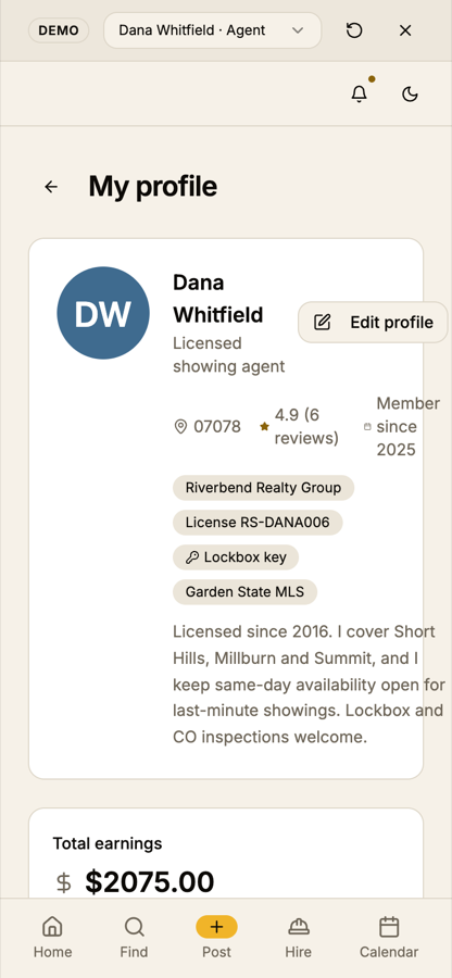
- Settings and Profile break at 390 wide. Settings keeps its two-column desktop layout on a phone and the toggles are cut off at the right edge. The profile header wraps its meta line into three rows and pushes the Edit profile button past the edge.
- Nine service filters fill the first phone screen on Find. At 390 the location chip plus the chips push the results below the fold; at 320 the first result is two screens down.
- Money is written four ways. "$85" and "$2,075" beside "$95.00 to $110.00", "bid $110.00", "$75.00" and "$2075.00". One rule, applied everywhere.
- Names drift between the nav and the page. The sidebar says Find Opportunities, My Opportunities, My Listings and My Wallet in title case; the pages say Available opportunities, My opportunities, My listings and Wallet in sentence case. The vendor flow is called Hire a vendor, Post a job to a trade, Browse vendors and Hire depending on where you stand.
- Two different page shells. Most pages open with a title and a one-line subtitle. Profile, Settings and Hire a vendor open with a back-arrow bar instead, and Settings' left menu is set at a larger size in title case, so it looks like a different app.
The phone has no way in
This one is structural, not cosmetic. The sidebar component is rendered with
hidden md:flex, and the button that would open it is hidden the same way, so below 768
pixels neither exists. The shadcn sidebar already has a phone mode that slides the same menu in as a
sheet; the app switches it off and never puts anything in its place.
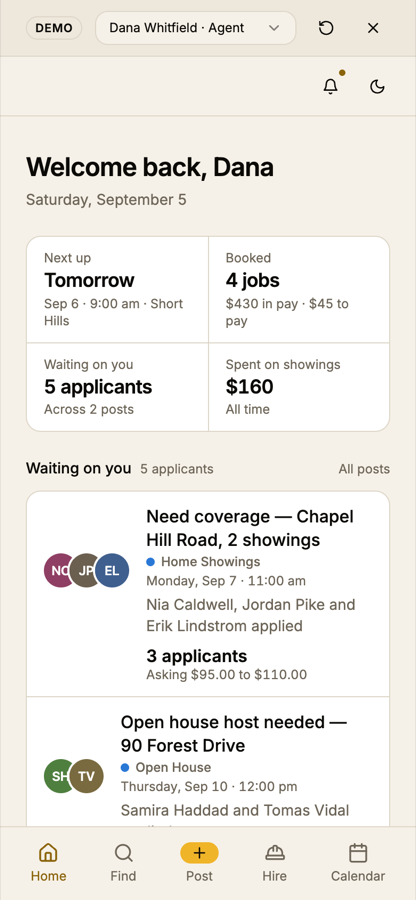
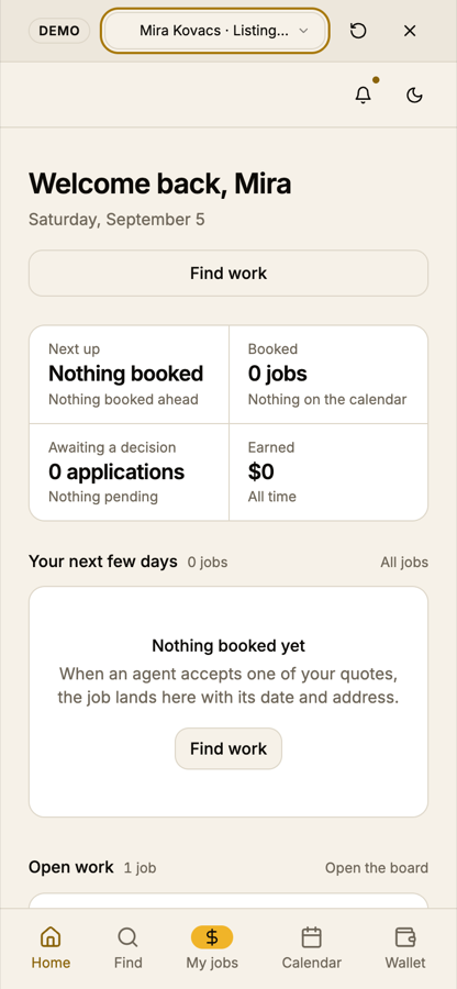
| Agent on a phone | How you get there |
|---|---|
| Dashboard, Find, Post a job, Vendors, Calendar | Bottom tabs. |
| My opportunities | Only the "All jobs" link on the dashboard. |
| My listings | Only the "All posts" link on the dashboard. |
| Wallet | Only "Open wallet" under recent activity on the dashboard. |
| Leads, Referrals | No route. The header search that would take you to Find is also hidden below 640. |
| Profile, Settings, How it works, Logout | No route. There is no way to sign out on a phone. |
What to do. Put the logomark at the left of the mobile header, and next to it a menu button that opens the existing sidebar as a sheet. That is the smallest change that gives every page a way in, and it reuses the role-aware list and the account block the sidebar already has, so contractors get their names and agents get theirs. Keep the five tabs exactly as they are; they are the right five. The search box can live inside the sheet on a phone rather than being dropped.
The alternative is a "More" tab in the bar. It is worse here: it costs Calendar or Hire their slot, and it duplicates a list the sidebar already maintains.
Two pages break at phone width
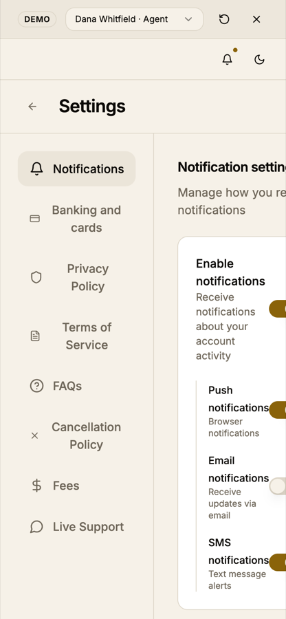
- Settings. Stack the menu above the panel below 768, as a horizontal chip row or a select. Bring its type down to the sidebar's size and to sentence case (Privacy policy, Terms of service, Cancellation policy, Live support). Give the page the same title-and-subtitle opener the rest use.
- Profile. Below 640, put the avatar above the name, let the meta line wrap as chips, and move Edit profile below the bio at full width. The earnings tile should read "$2,075" like the wallet. "Reviews & Ratings" wants to be "Reviews".
Drift: the things that make it read as generated
None of these is a bug. Together they are the difference between an app one person designed and a set of screens that were each fine on their own.
Naming
| Where | What it says | Suggestion |
|---|---|---|
| Sidebar | Find Opportunities, My Opportunities, My Listings, My Wallet, but How it works | Sentence case throughout, the locked convention: Find opportunities, My opportunities, My listings, Wallet. |
| Nav vs page title | Find Opportunities opens "Available opportunities"; My Wallet opens "Wallet" | Make the nav label and the h1 the same words. The subtitle is where the page explains itself. |
| The vendor flow | "Hire a vendor" (My listings, Post a job), "Post a job to a trade" (Vendors), "Browse vendors" (How it works), "Hire" (tab) | One label per intent. "Hire a vendor" for the flow, "Vendors" for the directory, and the tab stays "Hire". |
| Sort controls | Find uses a ghost button reading "Soonest"; Leads uses a full select reading "Freshest first" | One sort control, used on both boards. |
| Login tagline | "Every Showing. Every Task. We got you Covered" | Random capitals and a fragment chain. Either one plain sentence or nothing under the heading. |
| 404 | An uppercase "ERROR 404" kicker above the headline, and two buttons | Drop the kicker; the headline already says it. One button back to the dashboard. |
Money
The app has no single formatter. The dashboard says "$45" and "Asking $95.00 to $110.00" in the same card. Wallet and My opportunities say "$2,075"; Profile says "$2075.00" with no thousands separator. Leads say "$75.00" while jobs beside them say "$85". How it works says "$25.00" and "$10.00 on a $50.00 job". The Apply dialog, correctly, shows "$71.50" because the cents are real.
The rule to adopt: whole dollars with a thousands separator unless the cents are
non-zero, and one helper that everything calls. money() in the admin metrics file is
already most of it.
Page shells
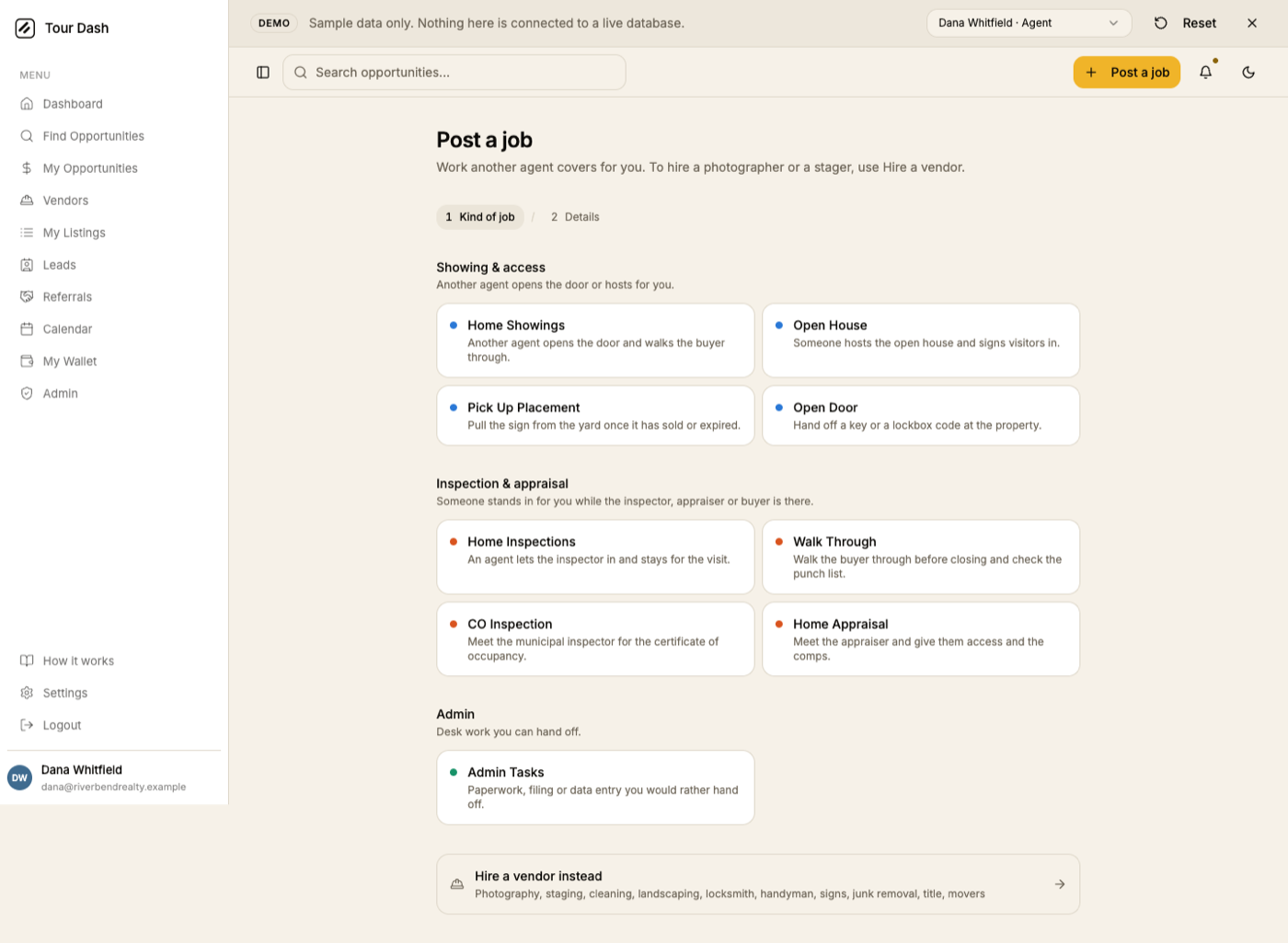
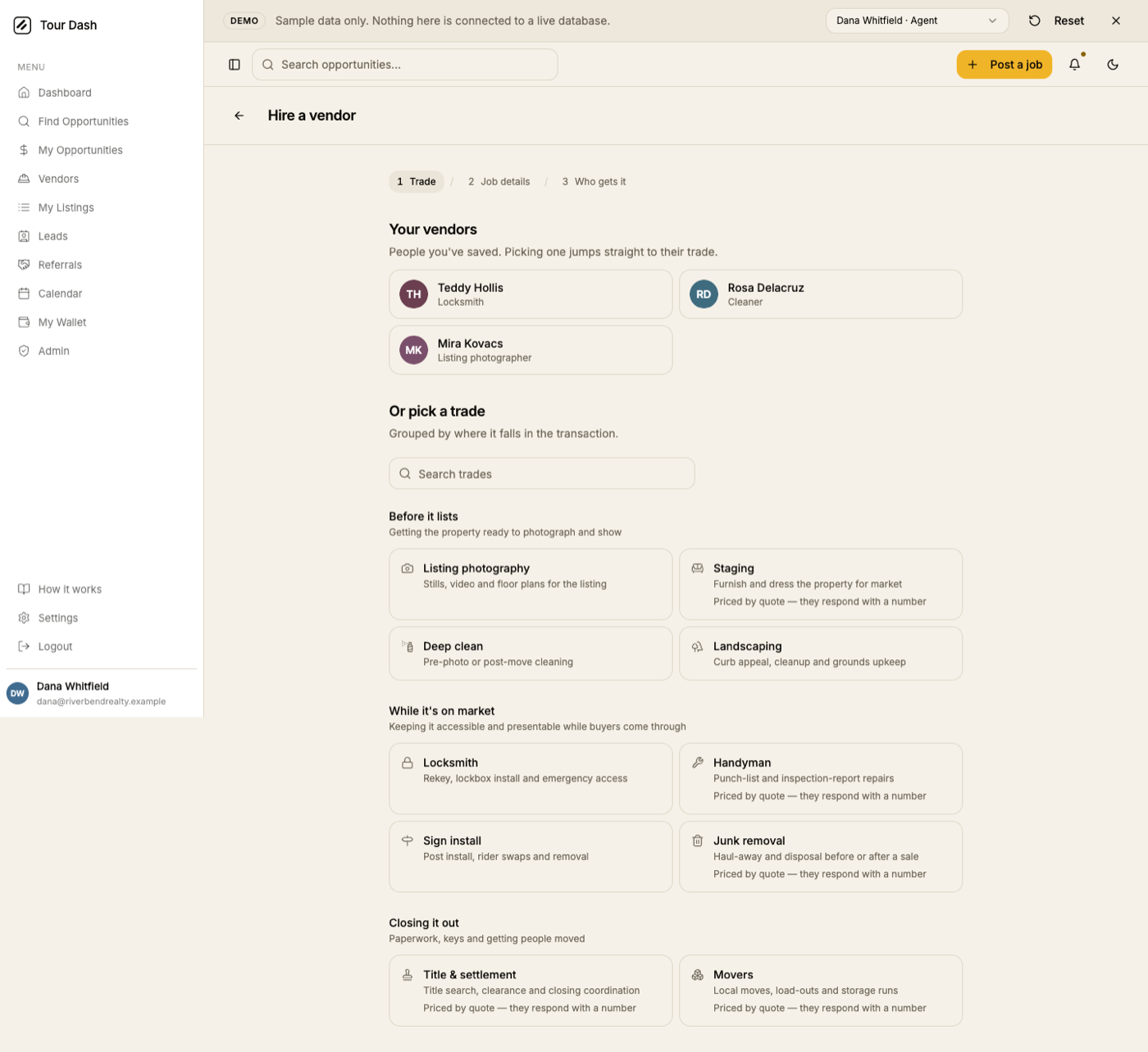
Pick the title-and-subtitle shell for everything. The back arrow is a browser button; when a page genuinely needs a way back, a small "Back to leads" link like the one on Sell a lead does it without a second header style.
Headline actions on a phone
Every page that has a header button renders it as a full-width secondary button above the figures on a phone: "Find opportunities" on My opportunities, "Sell a lead" on Leads, "Today" on Calendar, "Hire a vendor" and "Post a job" on My listings. It is consistent, which is good, but it spends the first screen on a button. Where the action is also in the tab bar (Post) or is a repeat of the page's own content (Find), drop it on mobile. Where it is the page's one job (Sell a lead), keep it and make it the amber primary.
The filter row on Find
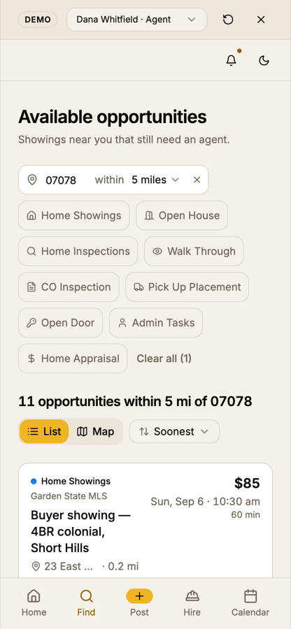
Below 640, collapse the service chips into one row that scrolls sideways, or behind a "Filters" chip with a count. The location chip and the result count are the two things that must stay visible; the list should start within the first screen.
What is holding up
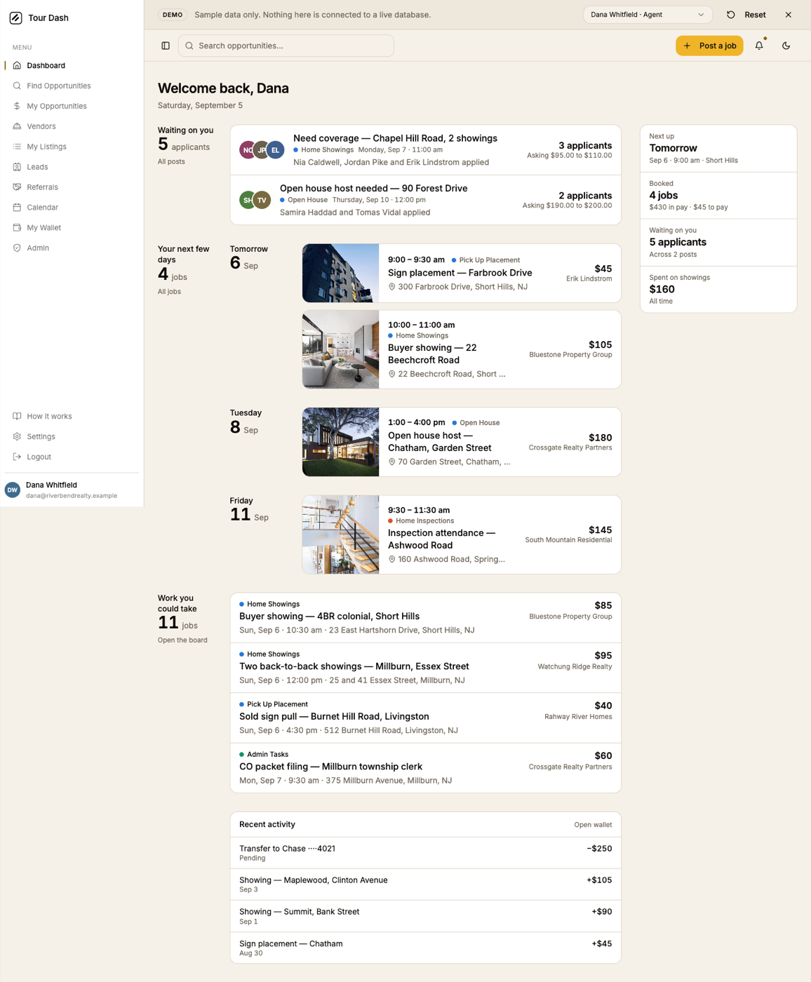
- Hierarchy by obligation, not by data type. "Waiting on you", "Needs you", "Out for applications", "In flight". The groupings on the dashboard, My listings and Referrals are the best thing in the app and they are what a template never does.
- The accent discipline holds. One amber element per screen, and it is always the primary action or the active state. Status chips stay neutral. This survived across every page shot.
- Three service colours, and shape for contractor work. Solid dots for agent jobs, hollow rings for vendor jobs, on the map legend, in the calendar and on every card. Consistent.
- Empty states are written, not generic. "Nothing booked yet. When an agent accepts one of your quotes, the job lands here with its date and address." That is a sentence a person wrote.
- The Apply dialog shows the fee. "You'd be paid $71.50, Tour Dash fee $13.50" before the button. Honest, and it is the kind of detail that builds trust with contractors.
- No horizontal scroll anywhere. Every route measured at 320, 390, 768, 1024 and 1440: scroll width equals the viewport on all of them.
- Dark theme is a real theme. Same hierarchy, same one accent, photos and chips sit correctly. Nothing is inverted by accident.
Small things
- Wallet chart blank on first paint, once. In one headless run the chart area was empty 3.5 seconds after load; in a second run it was fully drawn at 7 seconds. The console reports the ResponsiveContainer measuring a width of 0 on its first pass. Worth watching on a slow connection for a visible flash.
- A React nesting warning on two lists. A Badge, which renders a div, sits inside a paragraph in the lead rows and the open-work list. Harmless today, but it prints an error on every load of those pages.
- "Hover a vendor to see how far they travel." That subtitle is on the Vendors page on a phone, where nobody can hover. The map also hides behind a List/Map toggle there, so the sentence points at something off screen.
- Legends disagree. The map legend on Find shows three families (showing, admin, inspection); the calendar legend shows two. If admin work can land on the calendar, it needs the third dot.
- The demo banner and the header stack to 110 pixels on a phone. Demo only, but on a real phone the empty header row is the one that costs the space. Fixing section 02 fixes this.
- Landing page preloader. Out of scope for this review, but the counting-up loader on the marketing page held the first paint for several seconds in headless Chrome. If it does that on a phone connection it is the first thing a visitor waits for.
Suggested order
| Work | Why this position | |
|---|---|---|
| 1 | Mobile header: logomark, menu button opening the sidebar sheet, search inside the sheet. | Unblocks every page on a phone, including sign out. One component, one afternoon. |
| 2 | Settings and Profile at phone width. | The only two pages that visibly break. |
| 3 | One money formatter, called everywhere. | Mechanical, touches many files, and it is the most visible tell. |
| 4 | Sidebar labels to sentence case; nav label equals page title; one name for the vendor flow. | Copy only. Half a day including a search for stragglers. |
| 5 | Retire the back-arrow shell on Profile, Settings and Hire a vendor. | Small layout change, large consistency gain. |
| 6 | Find's filter chips collapse below 640; mobile header buttons trimmed per page. | Gets the first result onto the first phone screen. |
| 7 | The small things above. | As they come up. |
What shipped the same day
Items 1, 2, 4 and 6 from the order above, plus the naming on the bar and the menu, went live on 5 September. Money formatting, the back-arrow shell on Hire a vendor and the small things are still open.
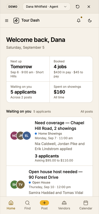
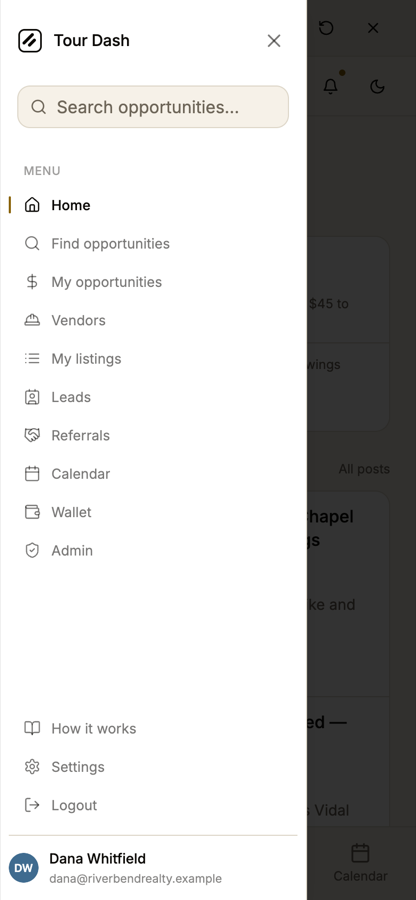
- The phone has a menu. Below 768 the sidebar slides in as a sheet from a menu button at the left of the header, which now also shows the logomark and wordmark. The sheet holds the search box, every page for the account type, How it works, Settings, Logout and the account block, with a close button. Picking a page closes it, and the search box no longer takes focus on open, so the keyboard stays down.
- Settings and Profile at 390. Settings stacks its section list as a sideways-scrolling row above the panel, in sentence case at the sidebar's size, under the same title-and-subtitle opener the other pages use. Profile stacks the avatar above the name below 640, wraps the meta line, and reads "$2,075".
- Find's filters fit. Below 640 the service chips run as one row that scrolls sideways, so the first result is on the first screen at 390 and 320. Desktop packing is unchanged.
- One name per place. The sidebar is sentence case and says Home, Find opportunities, My opportunities, Vendors, My listings, Wallet. The bar's Hire tab is Vendors. The board is titled Find opportunities (Find work for a contractor) to match its menu item. The vendor wizard is "Hire a vendor" on the Vendors page too, in place of "Post a job to a trade".
- Header buttons that duplicate a tab (Find on My opportunities, Post a job and Hire a vendor on My listings) are desktop-only. Today and Sell a lead stay, at their own width.
How this was checked
- Every route shot in a real browser. Headless Chrome driven over the DevTools protocol
against
/demo, so no live data was touched. Nineteen routes at 1440 in light, nine in dark, sixteen at 390 with touch input, plus 320, 768 and 1024 on the pages with the densest layouts. - Both account types. The agent sample account and a listing photographer, on desktop and phone, with the sidebar and tab lists read out of the DOM rather than assumed.
- Interactions. Notifications, the Apply dialog, Review applicants, the Leads Selling tab, and the demo account switcher, all opened and captured.
- Layout probes. Inner width, client width and scroll width read at every width; console errors and warnings collected on every page.
- Code read for the causes. The sidebar and its trigger, the bottom navigation, the header, the settings and profile layouts, and where money is formatted.