Hire a Vendor Redesign
The screen an agent uses to put work out to a photographer, a stager, a locksmith or a mover. It was ten identical bordered tiles, then three titled boxes around thirteen equal-weight fields, then two panels carrying three amber buttons between them. Every surface on it was the same shape, so nothing on it had a rank. It is now a worksheet with a running job ticket: the left column asks one step's worth of questions, and the rail beside it shows what has been decided and holds the single action that moves it on. Same data layer, same tokens, nothing renamed.
What was wrong with it
Not a colour or a font problem. The page had no hierarchy, so an agent read everything on it at the same speed and learned nothing from the order.
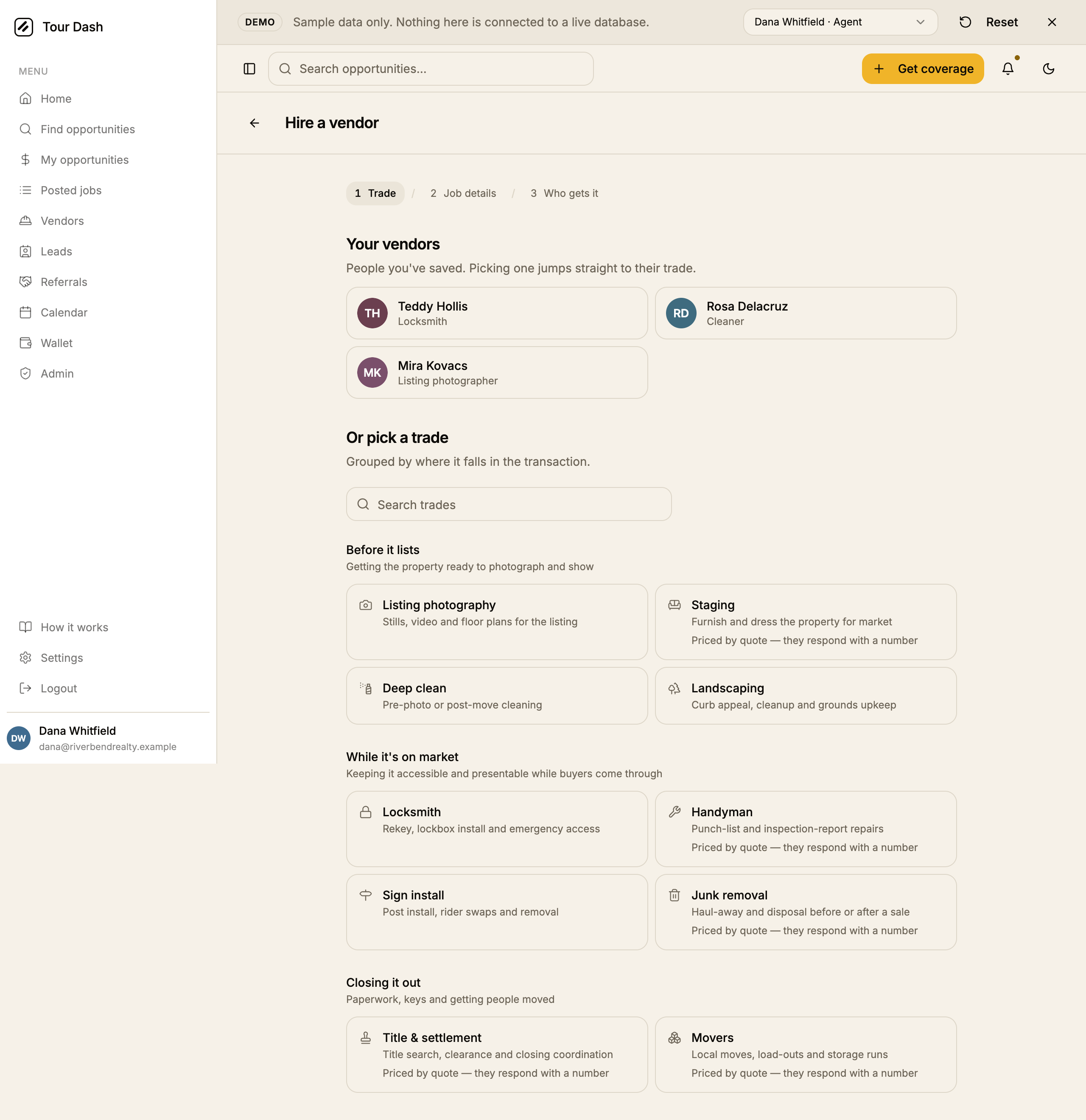
- Ten tiles of equal weight. Every trade got the same border, the same grey outline icon and the same two lines. Nothing said that a photographer is booked far more often than a mover, and the eye had no path through the list.
- Saved people looked like trades. The vendors an agent had already worked with were rendered in the same bordered rectangle as the trade tiles, so two different kinds of thing read as one list.
- The same sentence five times. "Priced by quote — they respond with a number" appeared under every quote-first trade. Repetition at that length stops being information.
- A search box above ten visible items. The whole list fitted on one screen. The input was furniture.
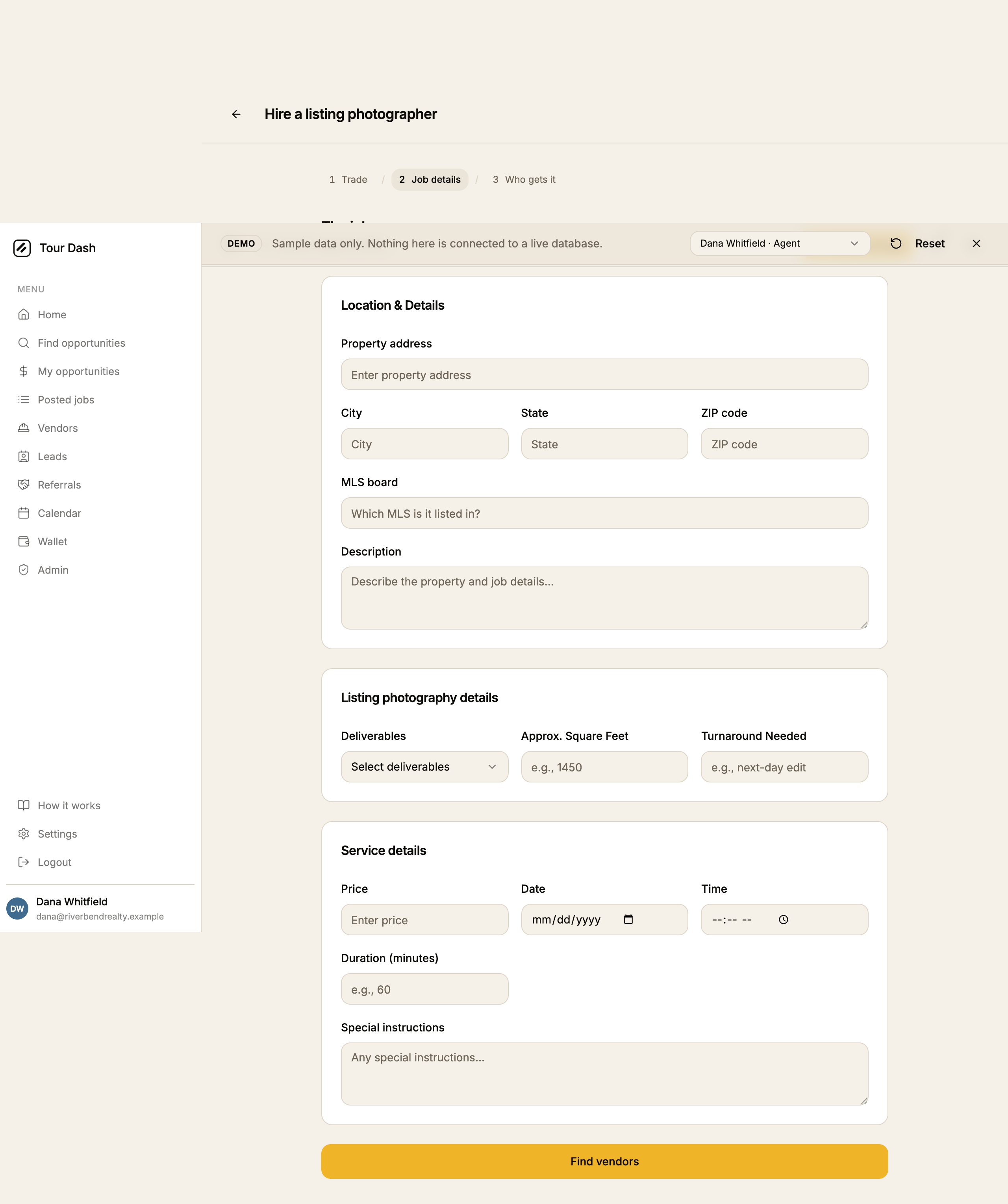
- Thirteen fields in three boxes. The job form put "Location & Details", "Listing photography details" and "Service details" in three identical cards, thirteen fields at the same weight, when only the address is required and most jobs go out with the price and the date blank.
- Title Case everywhere. "Location & Details", "Approx. Square Feet", "Turnaround Needed", "Rooms to Stage", "Known Title Issues" and twenty more, against a locked sentence-case convention.
- Three amber buttons on one screen. "Post it openly", "Send job" and the header's "Get coverage" were all in the estate amber that is reserved for the one primary action on a surface.
- A decorative stepper. The numbered breadcrumb was not clickable, carried no values, and repeated what the heading below it already said.
- A back-arrow header inside a shell that already has one, the open item left over from the September UI review.
- Five hundred pixels of dead page. The content sat in a narrow centred column while the list ran thirteen hundred pixels tall.
What it is now
A worksheet with a ticket. The left column asks one step's worth of questions. The rail on the right fills in as the answers arrive and carries the only amber control on the page. It sits beside the worksheet from 1280px and stacks under it below that, as one element moved by the grid rather than two copies switched by a media query.
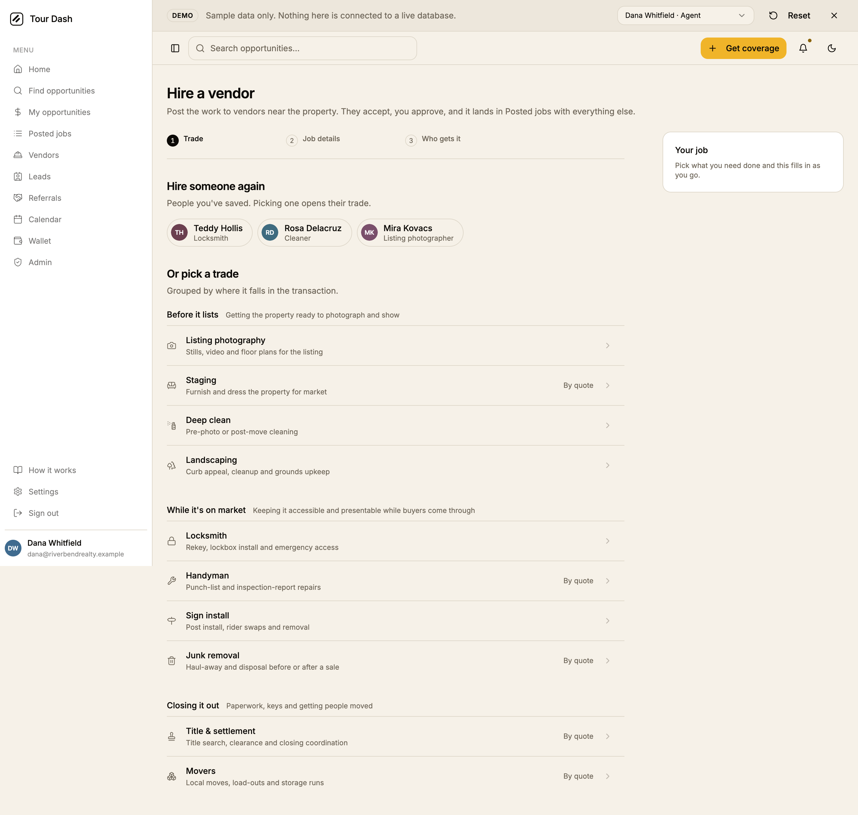
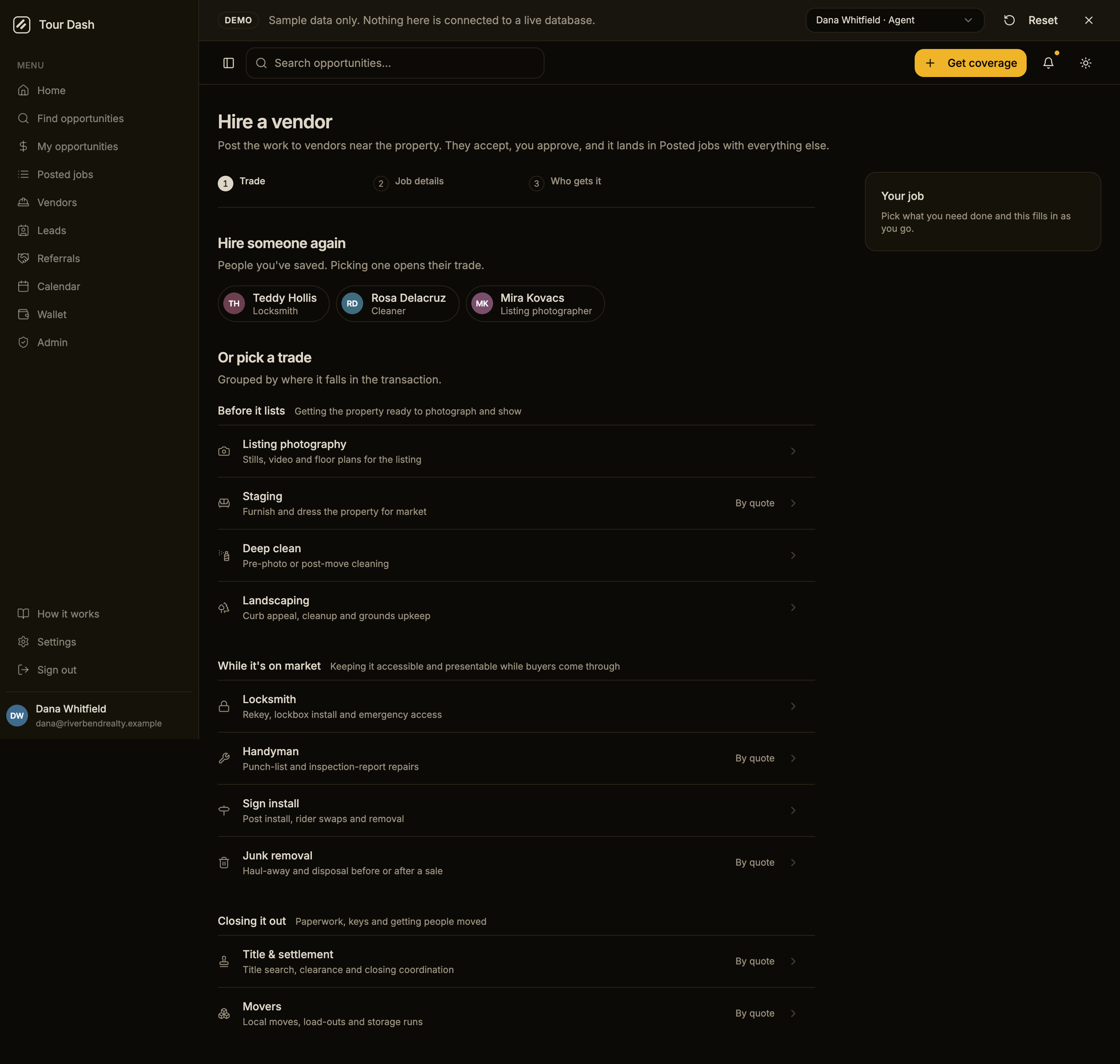
- Trades became a list. Grouped by moment in the transaction, divided by hairlines, with the icon, title and description on the left and a chevron on the right. Ten rows scan top to bottom in one pass; ten tiles did not.
- Only the exception is labelled. Quote-first trades say "By quote" in their own right-hand column. The other six say nothing, because a label on every row is the same repetition in a shorter coat.
- Saved vendors are chips. Avatar, name and trade in a pill, wrapping in a row. A different shape from the trade rows underneath, so the two never blur.
- The search box is gone. All ten trades fit on one screen under three headings.
- The stepper carries values and goes backwards. A finished step shows a check and its answer — "Trade / Listing photography", "Job details / 1200 Oak Street" — and is a link back to itself. The step in progress stays bare, because the ticket is where live state is read.
- The page header is a real heading.
h1in the page body with a line saying what happens after you send, instead of a back arrow in a bar inside a shell that already has one.
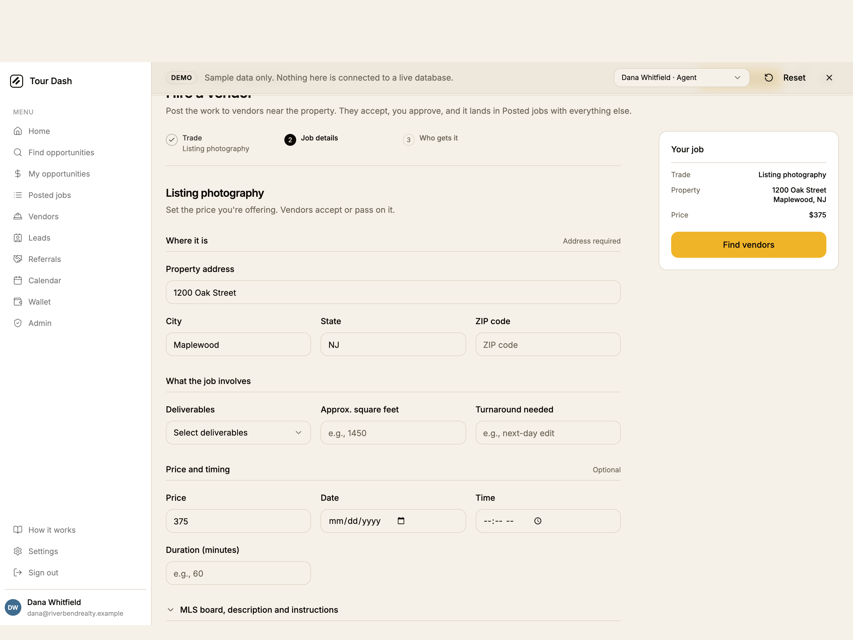
- The card shells came off. Sections are a heading and a hairline. The box was adding a border, not a meaning.
- Fields are split by how often they get filled, not by which schema constant they came from. "Where it is" is marked Address required; "Price and timing" is marked Optional; MLS board, description and special instructions are folded behind one disclosure. Nine fields on screen instead of thirteen.
- Every trade's labels are sentence case. Twenty-six of them, from "Approx. square feet" to "Known title issues". Field names in the database were not touched.
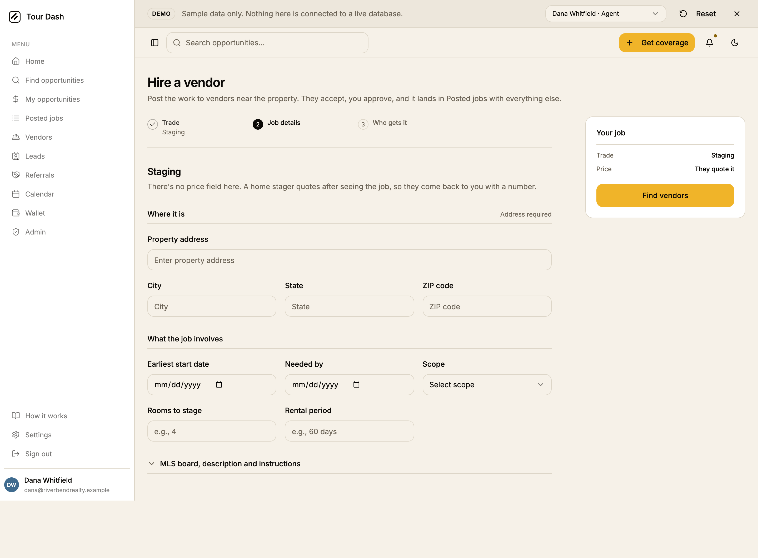
- Quote-first trades lose the whole section. Staging has no price and no appointment time, so "Price and timing" does not render at all rather than rendering empty. The ticket says "They quote it".
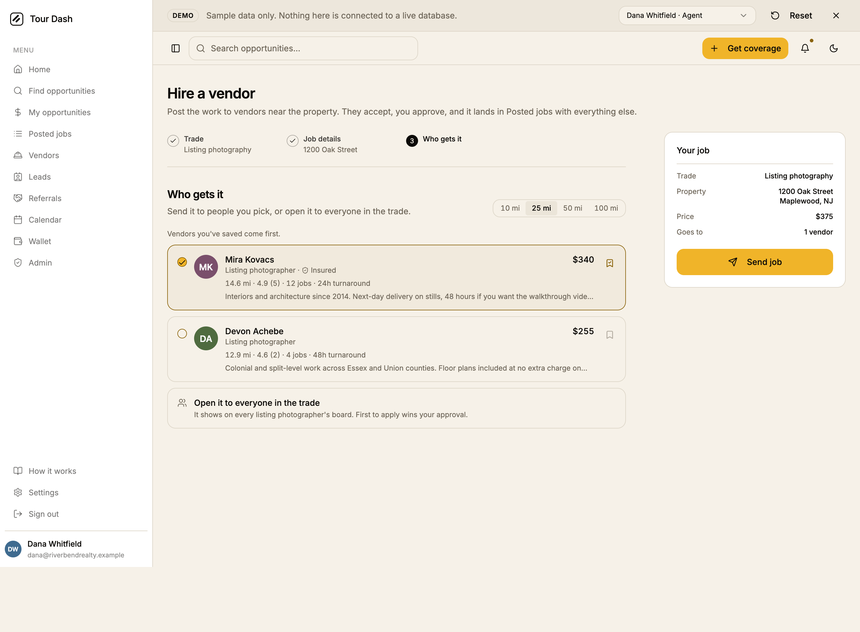
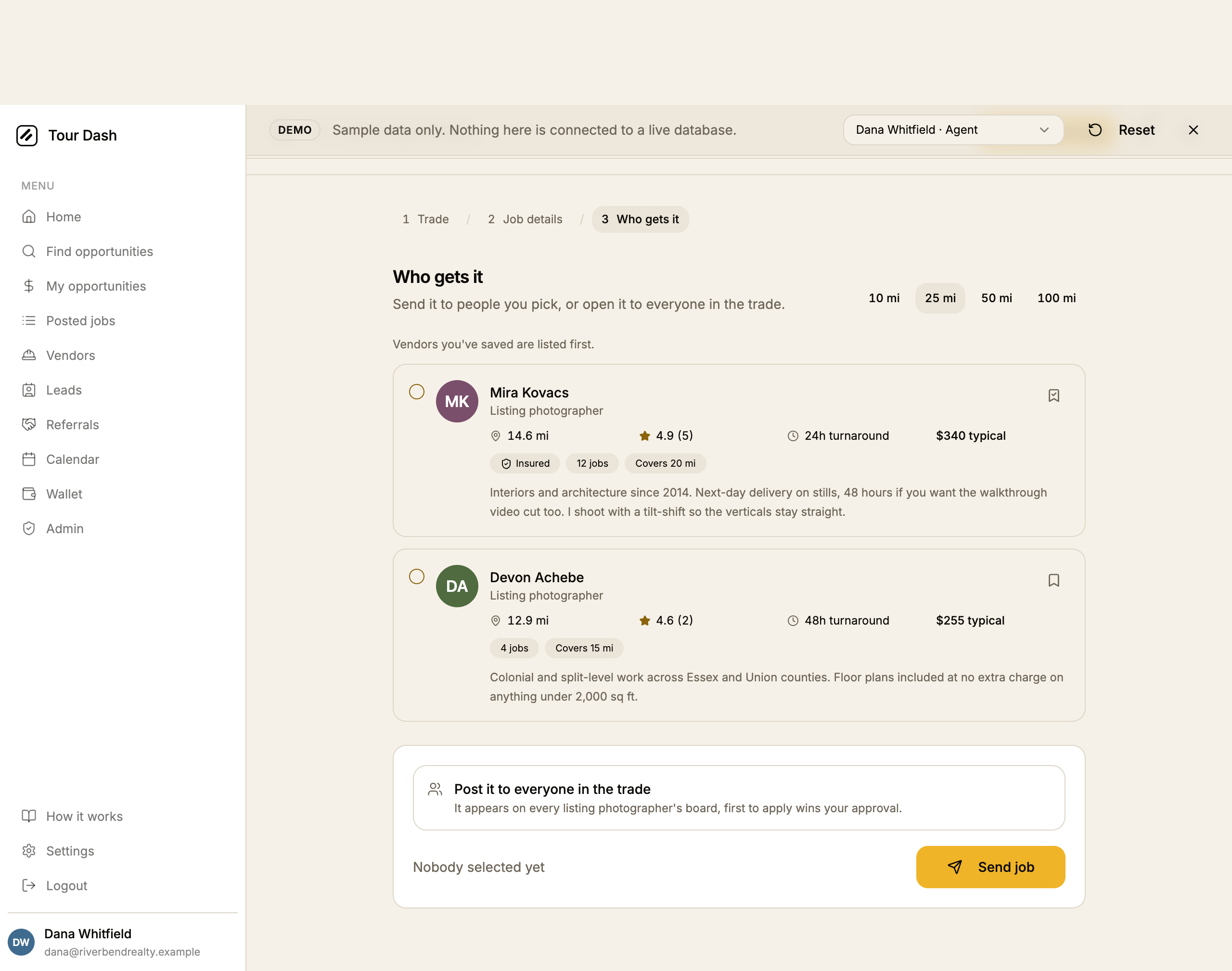
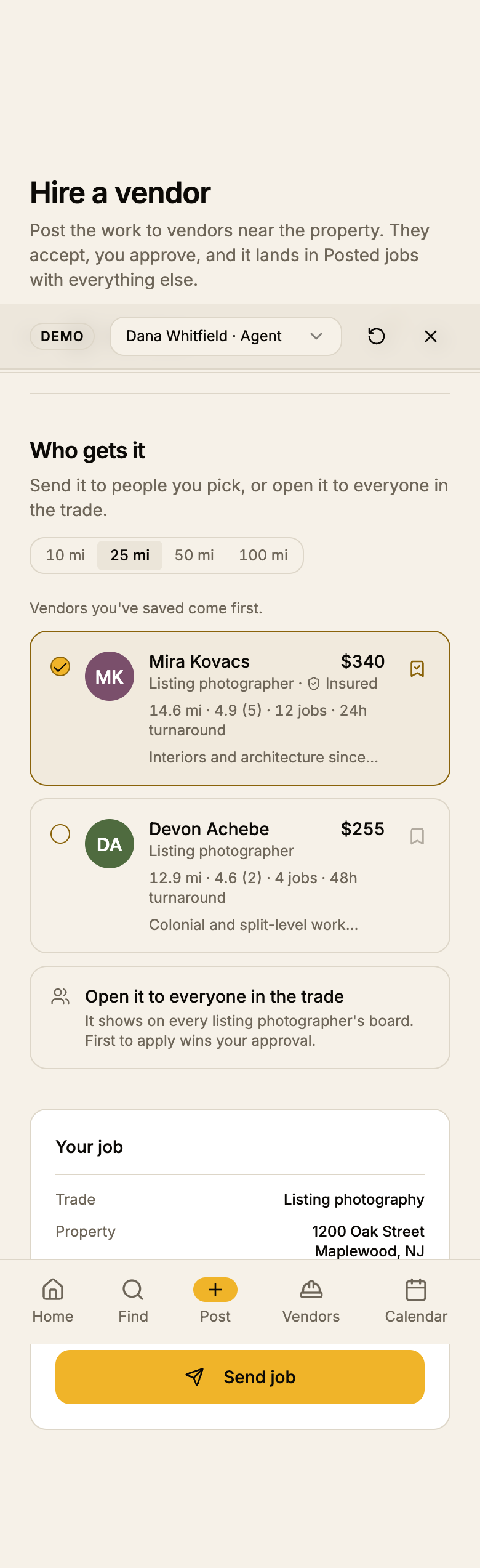
- The vendor row lost its badge soup. Four grey pills and a four-item fact list became the name with the rate opposite it, then one meta line: distance, rating, jobs done, turnaround. Insurance and licence sit with the trade. The bio is one line.
- Opening it up is a peer row. "Open it to everyone in the trade" is the last row of the same list as the people, because it is one of the answers to "who gets it", not a second decision in a second panel.
- One amber control. Send job, in the rail. It replaced three. Selection state uses the accent as ink on the check and the border, which is the active state the token allows.
- The radius picker is a segmented control in its own bordered track, rather than four ghost buttons floating in the header row.
- The empty state kept both ways out but lost its own amber button: widening the search is the outline button, and opening the job up is the row that was already in the list.
Two things fixed on the way past
- The ticket was rendering twice. The first pass drew it once as a
hidden xl:blockrail and again as anxl:hiddenblock, which put two "Send job" buttons in the accessibility tree at every width and made the hidden one the first match for a screen reader or a script. It is now oneasideplaced by the grid: a second row below 1280px, a sticky right column above it. - The send button no longer greys out. Disabling it until somebody was selected produced a washed-out amber slab that read as broken. It stays live and the existing validation toast says what is missing.
Nomenclature
The page says vendor throughout, matching its own h1, the menu item
and the rename that already landed everywhere else in the app. The code still says
provider in hooks, columns and component names, which nothing here changed.
How it was verified
Headless Chrome driven over CDP against /demo, which makes no
Supabase requests.
| Check | Result |
|---|---|
| Widths | 390, 768, 1024, 1280 and 1440. scrollWidth equals clientWidth at every one: no horizontal overflow. |
| Themes | Light and dark, forced through localStorage['tour-dash-theme'] before navigation. |
| Both rate bases | Listing photography (fixed price) and Staging (quote-first, window-timed). |
| Console | Clean. Only Vite's connection messages and the React DevTools notice. |
| Types and build | tsc --noEmit clean, npm run build succeeds. |
Files
| File | What changed |
|---|---|
src/pages/HireProvider.tsx | Rewritten as the worksheet plus ticket, the step list, the folded field group and the peer open-it-up row. |
src/components/TradePicker.tsx | Rewritten as a divided list; the search box and its empty branch are gone. |
src/components/ProviderCard.tsx | Rewritten as a row with the rate opposite the name and one meta line. |
src/lib/provider-trades.ts | Twenty-six field labels sentence-cased. No field names touched. |
Both components are used only by this page, so nothing else moved.