Find Opportunities Redesign
The board an agent opens every morning was a tall stack: a map that filled the first screen, the jobs starting below the fold, and eleven amber apply buttons in a row. It is now a list beside a map that stays put while you scroll, with one filter row, cards you can read down a column, a sort, and a map and list that point at each other. The details dialog that opens from a card was rebuilt in the same language. Same data layer, same tokens, nothing renamed.
What was wrong with it
The page had every piece it needed and put them in the wrong order. Nothing here is a bug; it is a layout that made the person do the work the layout should have done.
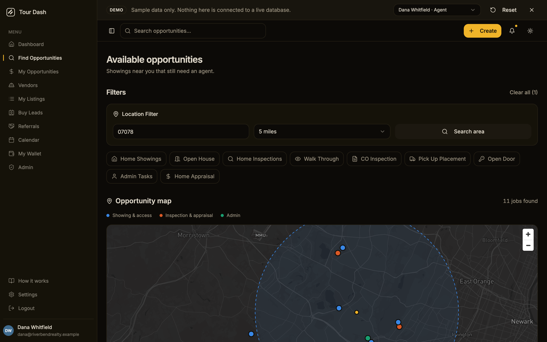
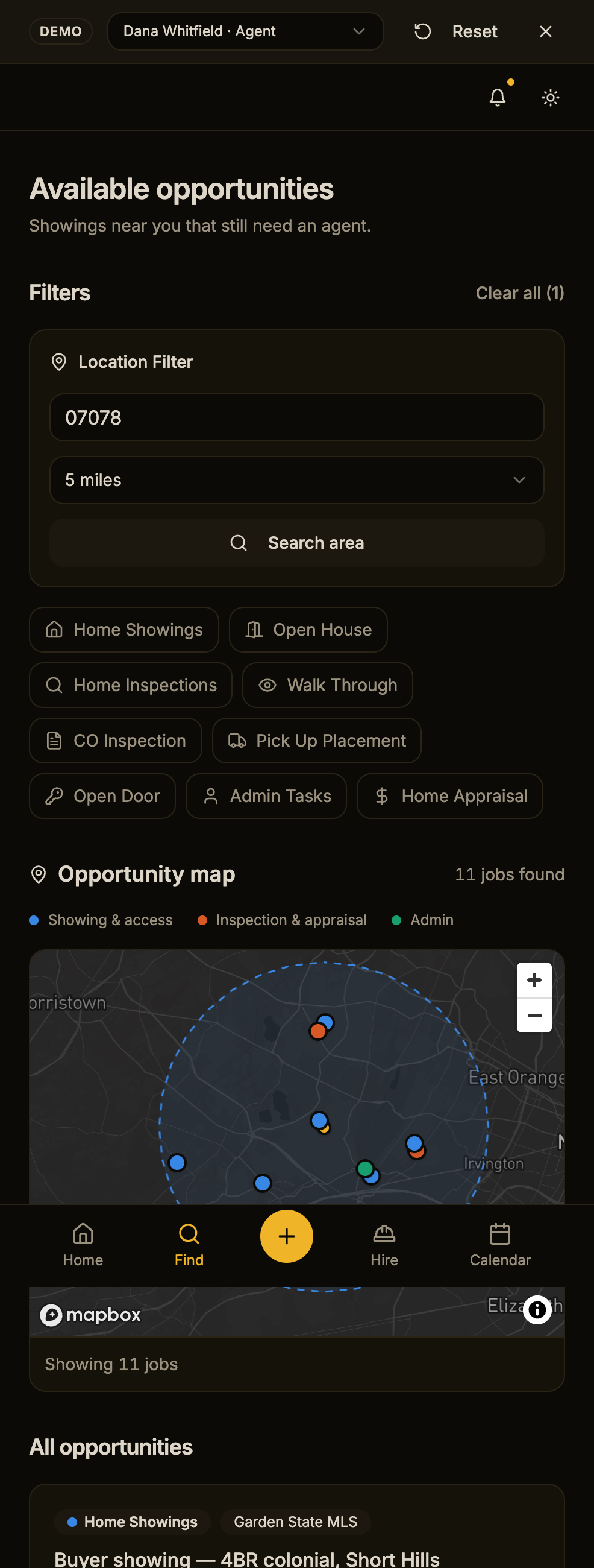
- Map first, list later. A 32rem map owned the first viewport, so the job list, the thing the page exists for, began below the fold. On a phone the page ran to five screens of identical cards.
- Eleven primary buttons. Every card carried a full-width amber "Apply now". The convention reserves amber for the one primary action on a surface; eleven of them is wallpaper, and the actual decision about money happens in the apply dialog anyway.
- Three levels of filter chrome. A "Filters" heading over a "Location Filter" card over a chip row, for four controls. "Location Filter" was also Title Case.
- The same count three times. "11 jobs found" in the map header, "Showing 11 jobs" in the map footer, and "All opportunities" as the list heading, none of which said where you were looking.
- The poster outweighed the job. Avatar, name, title, rating, ZIP and a "112 jobs completed" badge took more of each card than the pay, the date and the address.
- Map and list were strangers. Hovering a card did nothing on the map; clicking a pin opened a dialog over everything.
- A spinner for loading instead of the shape of what was coming.
What it is now
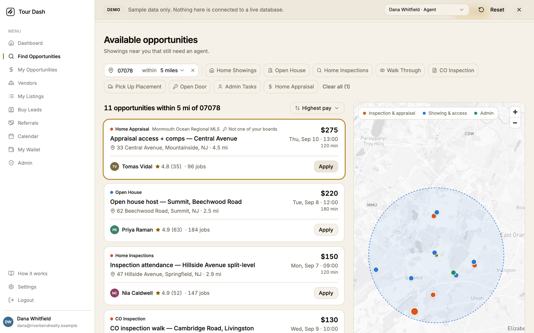
A list-detail board. The list scrolls on the left, the map stays pinned on the right at full viewport height, and the two describe the same set of jobs.
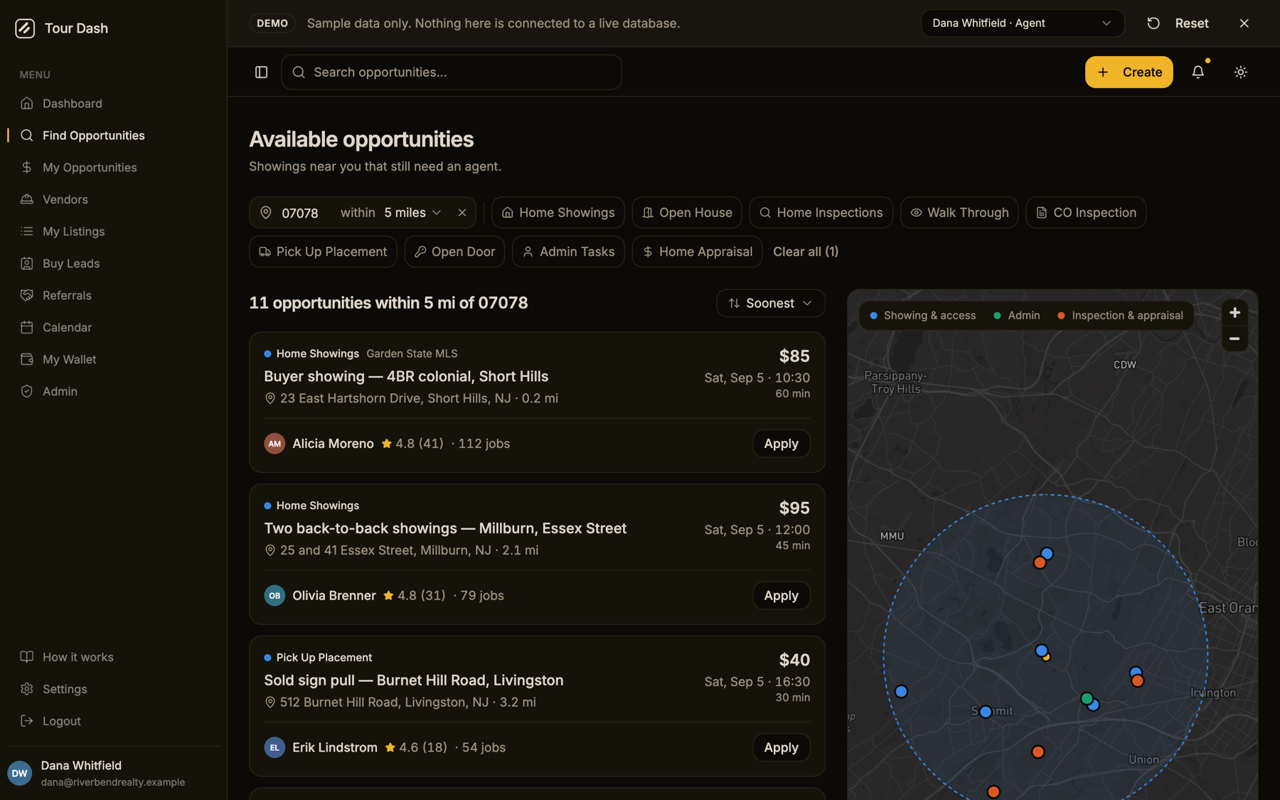
- One filter row. The location reads as a sentence, "07078 within 5 miles", with the service chips flowing beside it and wrapping at the container edge. Changing the radius on an applied ZIP takes effect without a round trip; the Search button only appears once the ZIP has changed. A header search term shows up here as a removable chip, and "Clear all" trails the last chip instead of sitting on a line of its own.
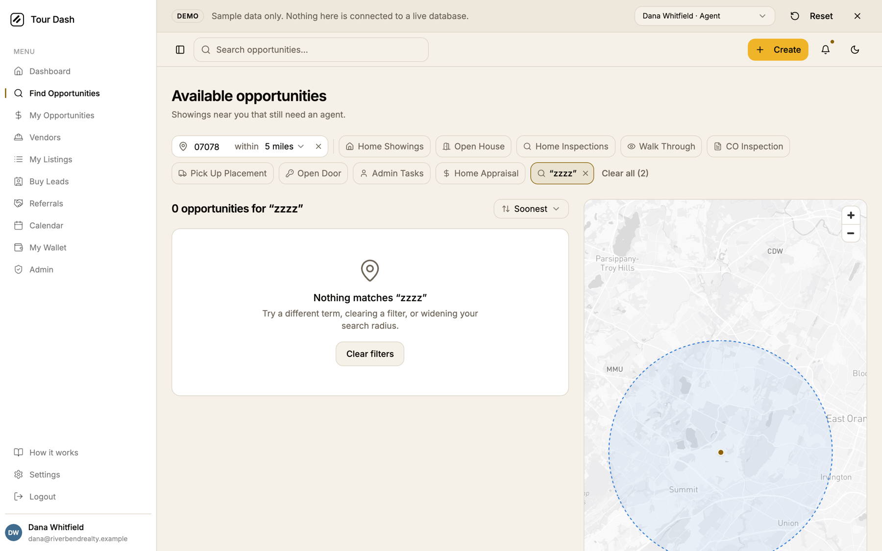
- One heading that says where you looked. "11 opportunities within 5 mi of 07078", or "3 opportunities for “beechwood”", or "0 opportunities for “zzzz”". The three old counts are gone.
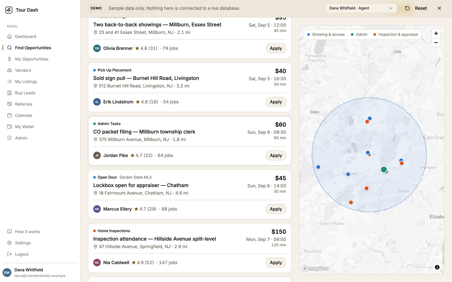
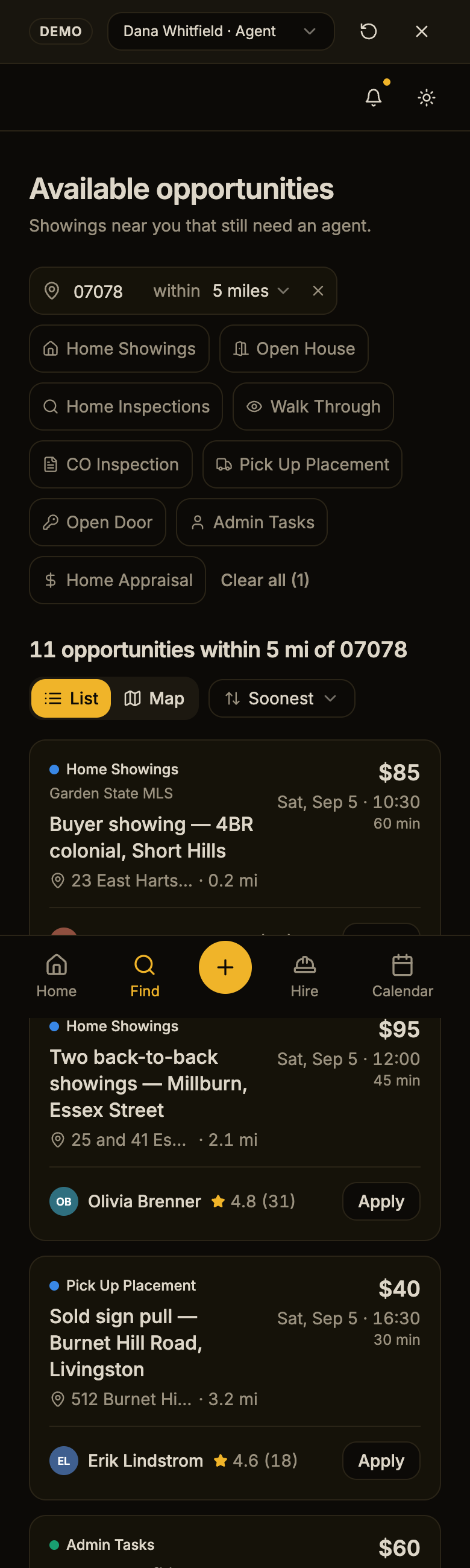
- Cards built to be scanned. Type mark, MLS board and any "Sent to you" or "Not one of your boards" note on the top line; the title; the address with distance. Pay, date and duration are pinned to the right edge in tabular figures so they line up down the column. The poster is one line: avatar, name, rating, jobs.
- Apply is an outline button. Amber now belongs to the apply dialog, where the price is named and the decision is made. Active filter chips and a selected card keep the accent as a state, which is what the convention allows.
- Sort. Soonest (the default), Newest, Highest pay, and Nearest when a location is set.
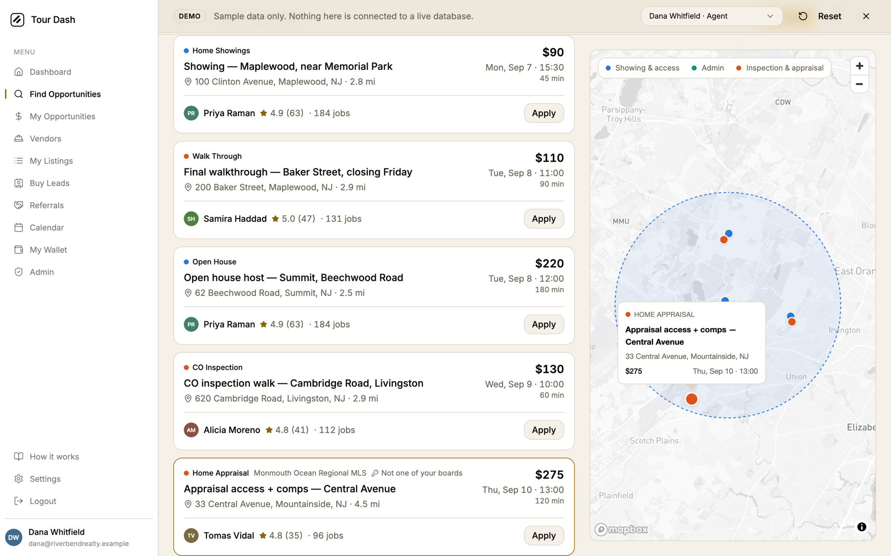
- Cross-highlighting. Hovering a card, or focusing its title with the keyboard, scales its pin to 1.5x and lifts it above its neighbours. Clicking a pin beside the list picks the card, gives it the accent border and scrolls it into view; the popup carries the summary. On a phone, where the list is behind a toggle, a pin opens the full details instead.
- The map fits the search area, not just the pins, so an empty board still shows the radius you looked inside. Mapbox's white popup and zoom control now take the card tokens in both themes.
- Loading is four skeleton cards in the shape of the real ones. The two empty states, the filter miss and the radius miss with its "nearest is 6.2 miles out" answer, are unchanged and now sit beside the map rather than under it.
- Phones get a List / Map toggle under the heading. The map mounts hidden and resizes itself when shown, so it never comes up blank.
- Small things: "Sat, Sep 5 · 10:30" instead of "Sat, Sep 5 10:30" everywhere the adapter formats a time; "Apply now", "View profile" and "Posted by" in the details dialog; the dialog shows the real service label instead of a title-cased slug; the dialog no longer logs a missing-description warning on every open.
The details dialog
Opening a card used to land on a dialog from a different app: icon rows in two loose columns, a lone "$ 85" with a dollar icon, a title-cased slug for the service, and a grey profile box with five stars. It now reads in the same order as the card.
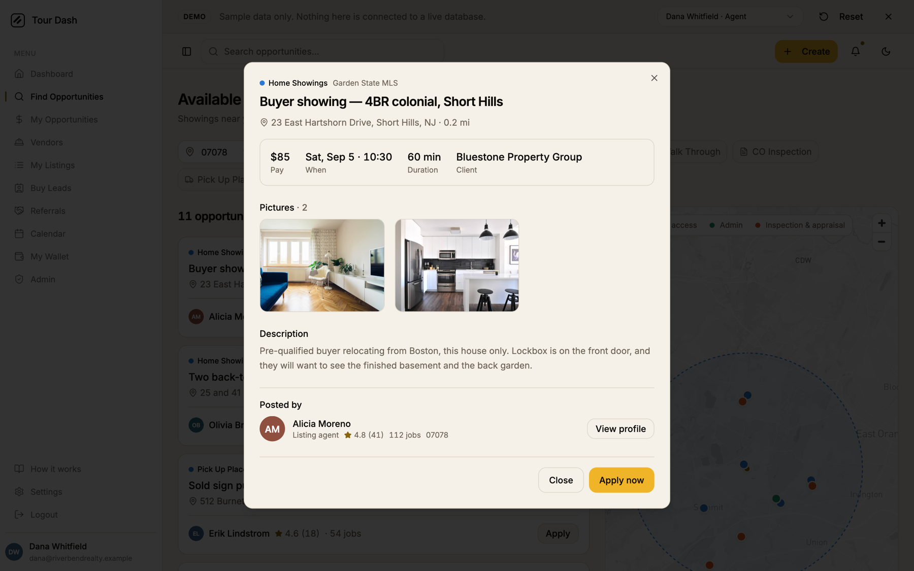
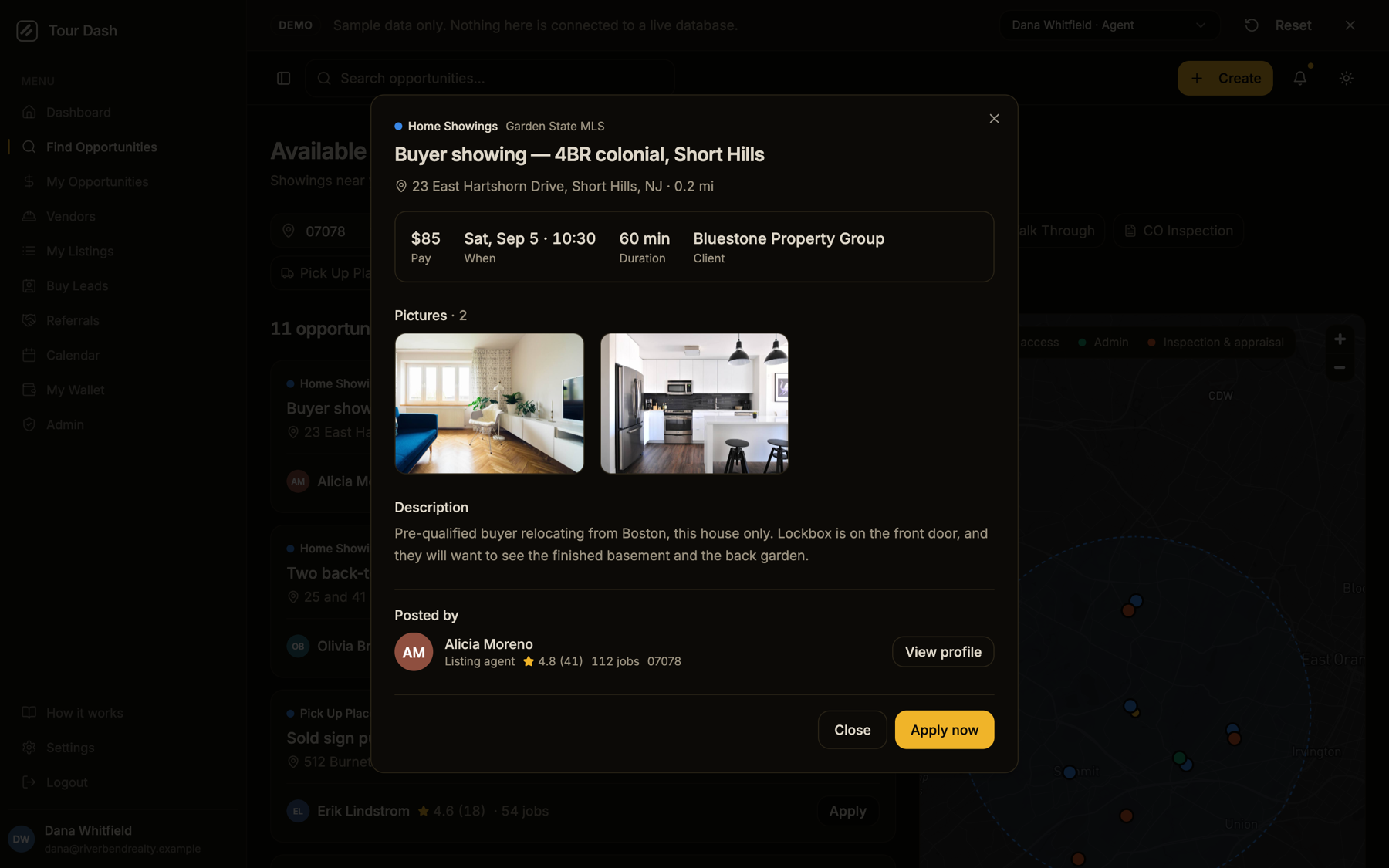
- Same top line as the card. Service mark and label, the MLS board, and "Sent to you" when it applies. The address line carries the distance and doubles as the dialog's accessible description, so the missing-description warning is gone for the right reason.
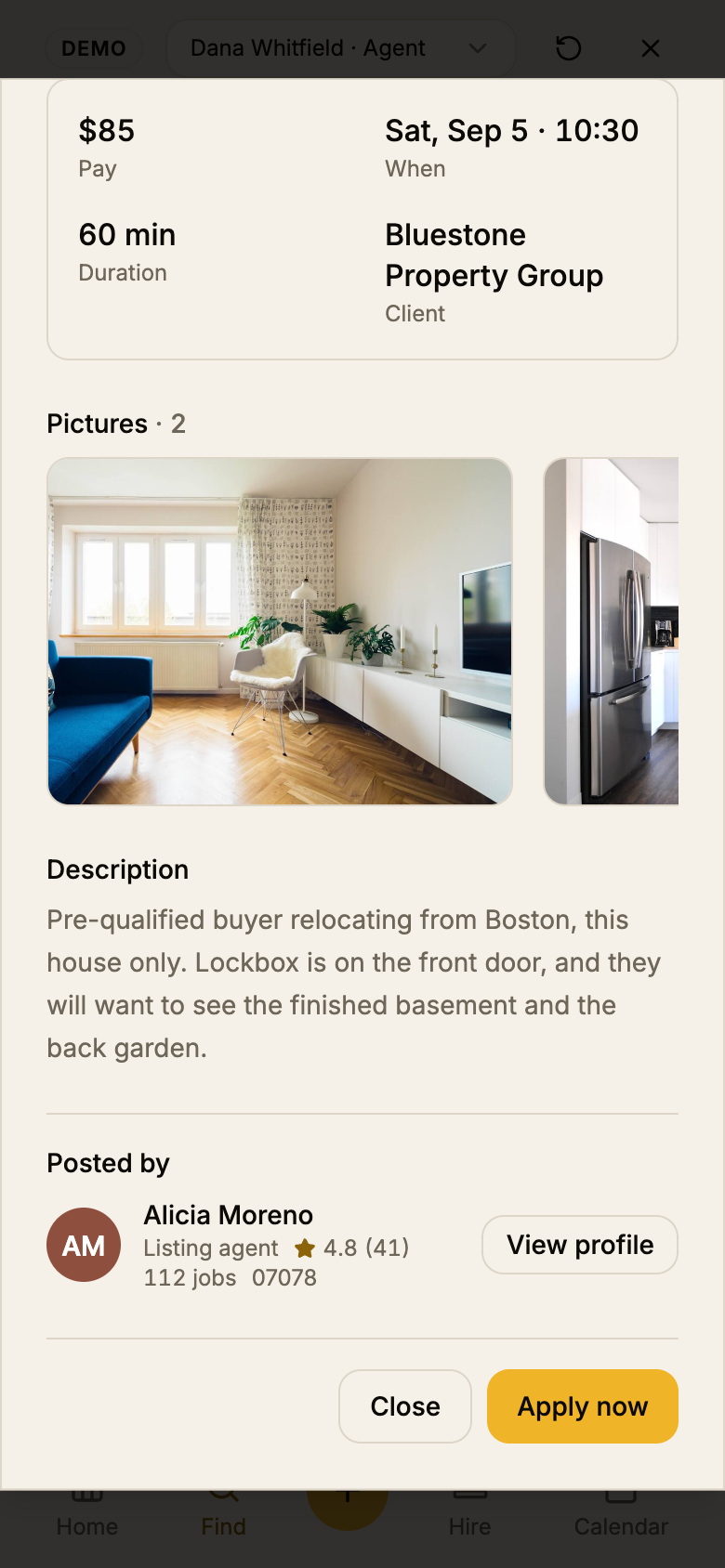
- A facts strip for pay, when, duration and client, label under value like a receipt. Values wrap rather than truncate; on a phone it is a two-by-two.
- Pictures, description and requirements under small sentence-case labels instead of icon headings. The photos lost their hover zoom, which clarified nothing.
- Posted by is one line: avatar, name, title, rating, jobs, ZIP, and an outline "View profile". The five-star row and the grey box are gone.
- The footer is right-aligned, Close beside Apply now, and the apply label follows the card: a vendor on quote-first work sees "Send a quote".
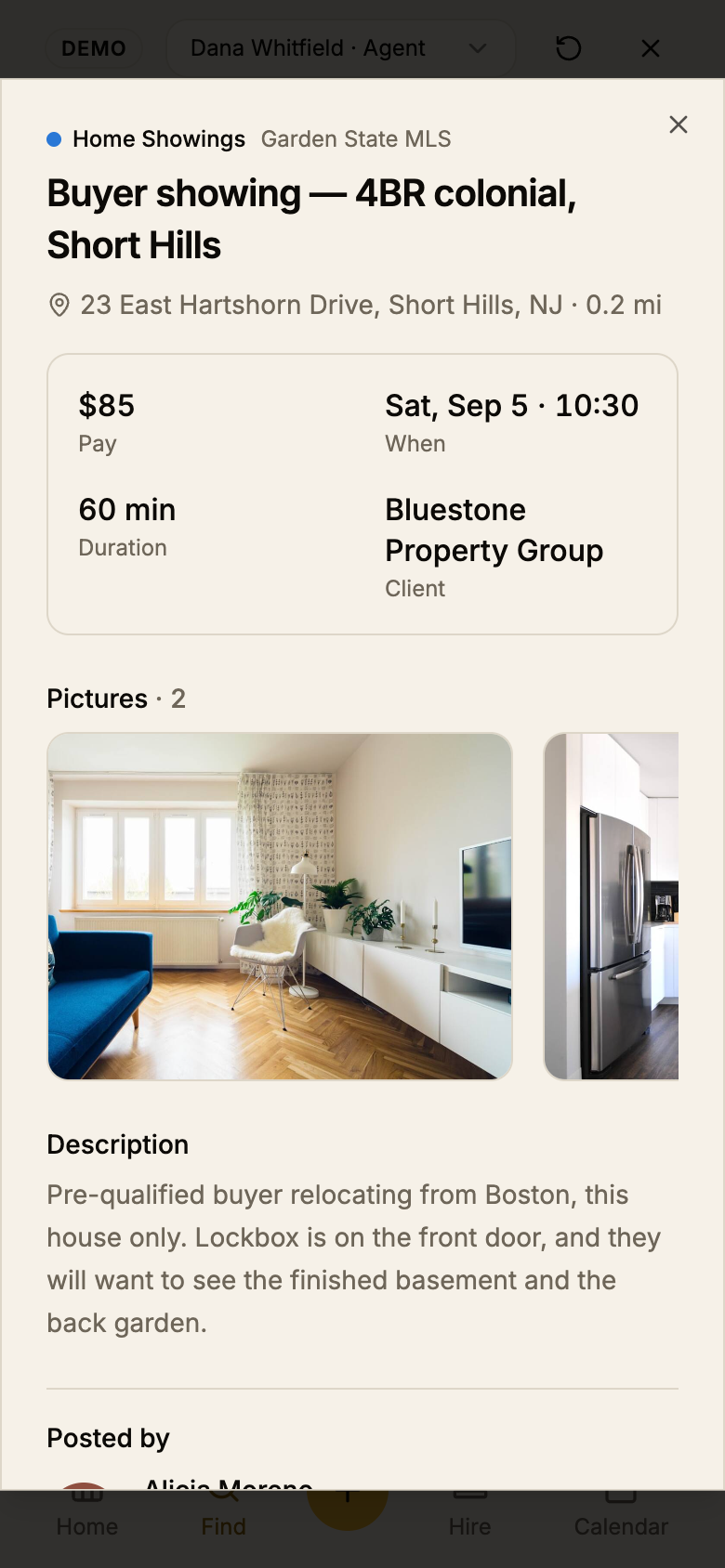
That last caption covers a real bug the dialog work turned up. On a 390px phone the
board was being laid out at 442px, and every fixed dialog inherited the extra width, so its
right edge ran off the screen. Mobile Chrome widens the layout viewport to fit anything that
overflows, and two things did: the demo banner's fixed-width account switcher, and the card
list itself, whose grid had no named columns. An implicit auto track sizes to
the cards' max-content, so it asked for 442px and got it. Both grids on the page now declare
grid-cols-1, the banner's switcher shrinks below 640px, and the phone lays out
at 390. The earlier phone screenshots in this report were retaken after the fix.
Calls worth knowing about
Things that were decided rather than discovered, so nobody re-litigates them by accident.
- Amber left the cards on purpose. If a per-card apply needs to feel stronger, the answer is the selected-card border or a count on the list heading, not eleven filled buttons.
- Pin click behaves differently by width. Beside the list it selects; on a phone it opens the dialog. Same handler, one media query.
- "Clear all" counts the seeded location. The page opens on the profile's ZIP and radius, so "Clear all (1)" is always there. That matches the previous behaviour; clearing it shows every open job, which for the live database is everything in the country.
- Service names stay Title Case. "Home Showings", "Pick Up Placement" and friends are the labels in
create-service-schema, used by the create form, the dialog and the map. Fixing them is a one-line change in the schema, not on this page, and it changes copy across the app. - Three components were deleted:
FilterSection,LocationFilterandUserProfileCard. Each was used only by this page.OpportunityToolbarandOpportunityCardreplace them. - Name every grid's columns.
gridwith an implicit track is what widened the phone.grid-cols-1costs nothing and the same rule now sits on the dialog's own grid. - The map component no longer counts. Its footer ("Showing 11 jobs") is gone and it takes its height from the page, since that height differs between the sticky desktop column and the phone toggle.
How it was verified
The Chrome extension was not connected, so the checks ran through headless Chrome
over the DevTools protocol against /demo, which makes no Supabase requests.
Real mouse and keyboard input, not synthetic events, for anything with a state.
| Check | Result |
|---|---|
| Typecheck and build | tsc --noEmit clean; npm run build passes. |
| Widths | 390, 768, 1024, 1440 and 1920, light and dark. No horizontal scroll. The list is two columns at 768 and one beside the map from 1024. |
| Sticky map | After scrolling 700px the map's top edge sits at 80px, under the header. |
| Hover and focus to pin | Hovering the fourth card marks exactly one pin active at scale(1.5); leaving clears it. Focusing a title does the same. |
| Pin to card | Clicking a pin selects its card, scrolls it into view and opens the popup. |
| Sort and chips | Highest pay orders $275, $220, $150. One chip narrows the heading to "3 opportunities" and the map to three pins. |
| Dialogs | Card opens the details dialog with "View profile", "Close", "Apply now" and a facts strip reading $85, Sat Sep 5 · 10:30, 60 min, Bluestone Property Group; the card's Apply opens "Apply for this job". Captured at 1440 in both themes and at 390. |
| Phone viewport | Layout viewport probed with the DevTools protocol: 493px before, 442px after the banner fix, 390px after naming the grid columns. No horizontal scroll. |
| Empty state | ?q=zzzz shows the filter miss beside a map that still draws the radius. |
| Phone map toggle | The hidden map renders at 443 by 542 CSS pixels when shown; a pin opens the details dialog. |
| Theme toggle | Switching themes live keeps the radius circle. This found and fixed a race where the layers drawn after the map's first load were wiped by a duplicate style request. |
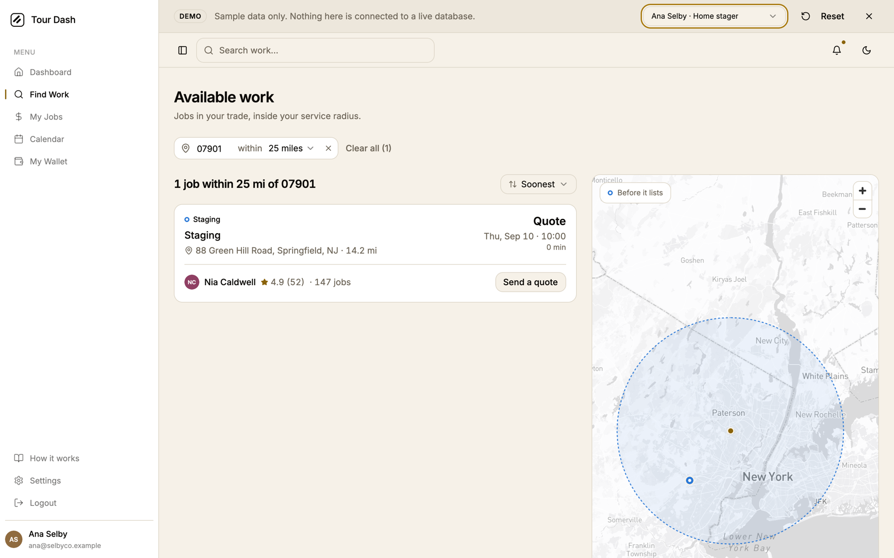
| Vendor view | As the demo's home stager: "1 job within 25 mi of 07901", no chips, "Send a quote". |
| Console | No errors or warnings across every scenario above. |
What's next
- Shipped. Committed to
mainas69cfe96, pushed to the GitHub backup, and deployed to tour-dash.pages.dev on 2026-09-04. - Sentence-case the service names in the schema ("Home showings", "Pick up placement") once it is decided they should change everywhere.
- The apply dialog still logs a missing-description warning on open. Same one-attribute fix the details dialog got.
- At 1024 the map column is narrow (about 300px). It works, but if laptops at that width matter, a 3:2 split or collapsing the sidebar by default there would help.
- Remember the sort. It resets to Soonest on every visit. A stored preference is a few lines if people ask for it.