The Brand Kit
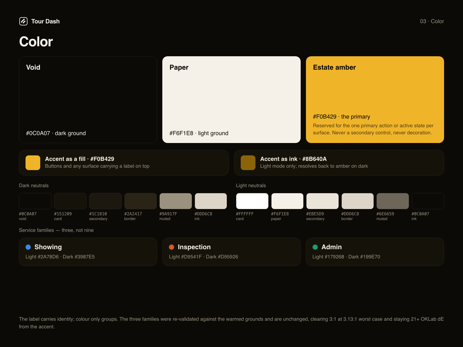
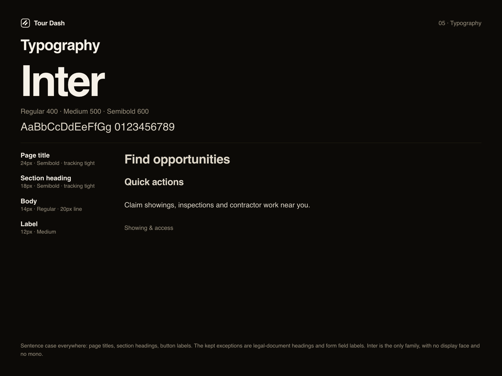
Tour Dash had been shipping a real visual identity for weeks without any of it being written down. This kit formalises it. It was first drawn as an options deck with two logo variations and two alternate palettes; on 2 September the owner called both halves, and the deck has been re-rendered as the decided system. The mark is the keyline tile. The palette is estate amber. Every colour here is the exact hex from the app’s own stylesheet.
The system
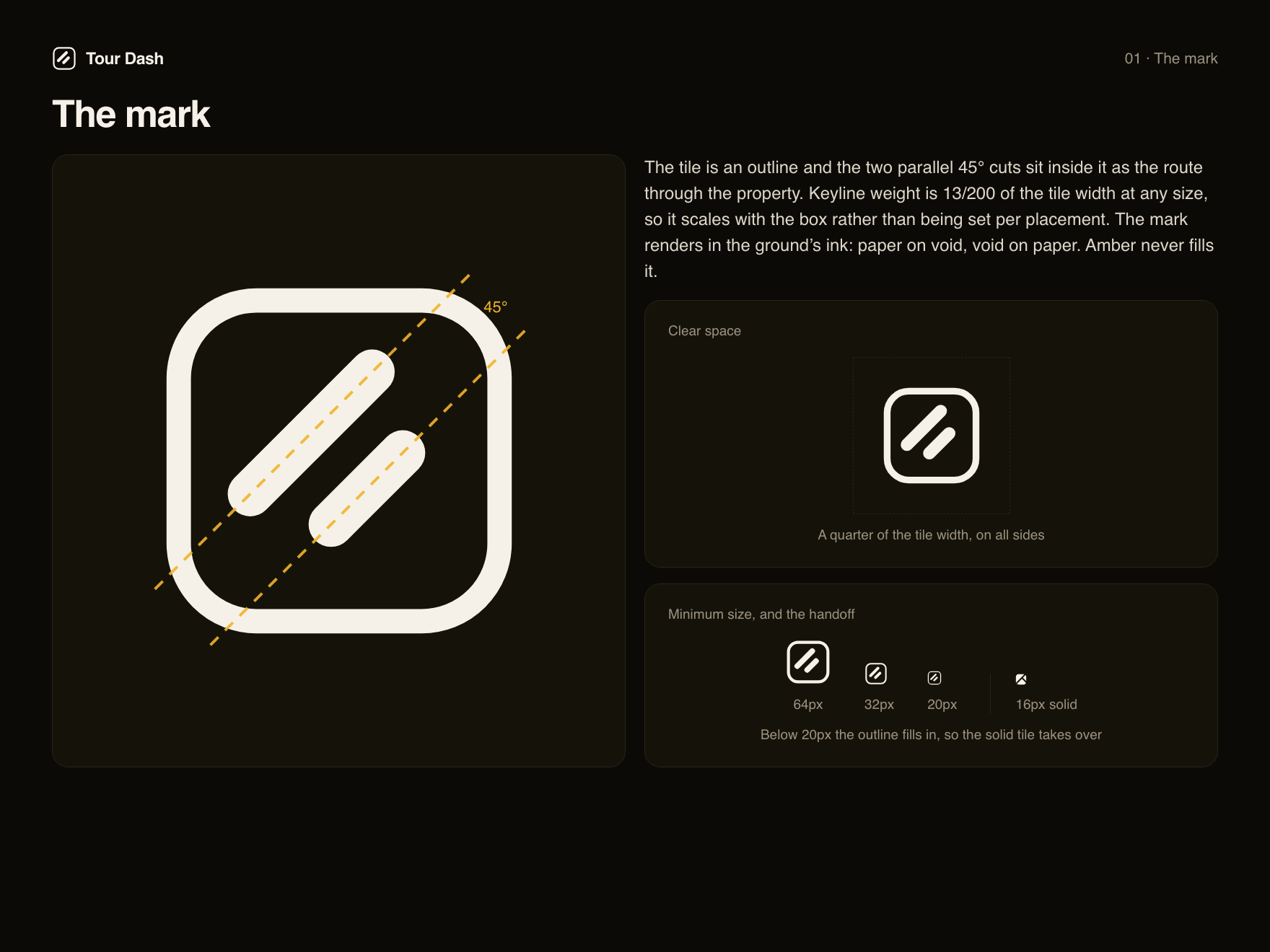
Six boards cover the identity as it now ships. The mark gets the formal reading it never had: a rounded tile opened to an outline, with two parallel 45° cuts inside it forming the route through the property, and the negative space between them making the dash the product is named for. The keyline weight is a ratio rather than a value, so it holds at any size.
The accent rule
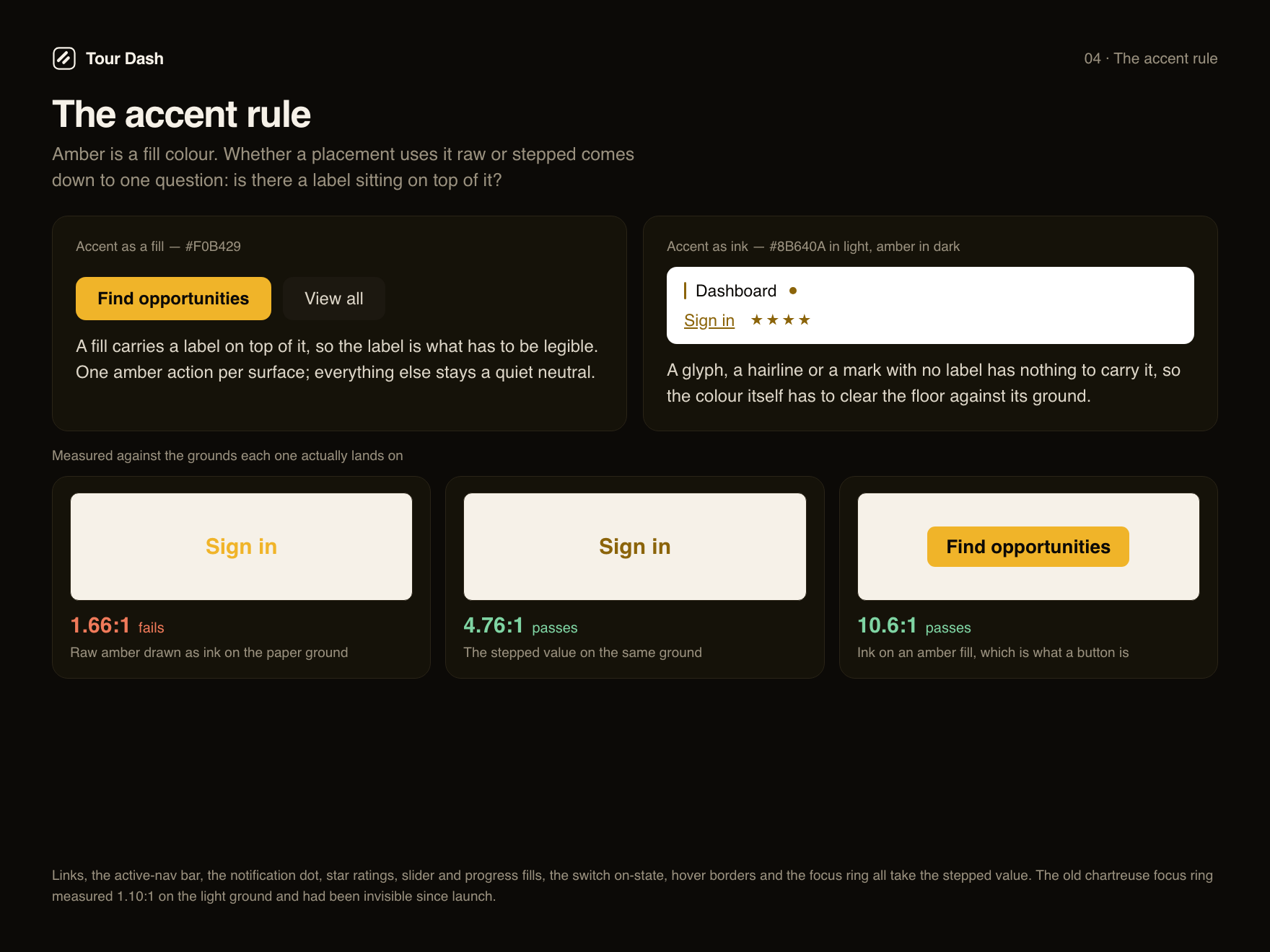
This board did not exist in the options deck, because the problem it describes only surfaced when amber was carried into the stylesheet. Amber is a fill colour. Ink on it measures 10.6:1, the strongest button contrast of the three schemes that were on the table. The amber itself is only 1.66:1 against the paper ground, so anything that draws the accent as a glyph, a hairline or a mark with no label needs its own step.
The old chartreuse had the same shape of problem and it had gone unnoticed: its focus ring measured 1.10:1 on the light ground, which means light-mode keyboard focus had been invisible since launch. Rather than carry that forward, the system gained a second token.
Secondary marks
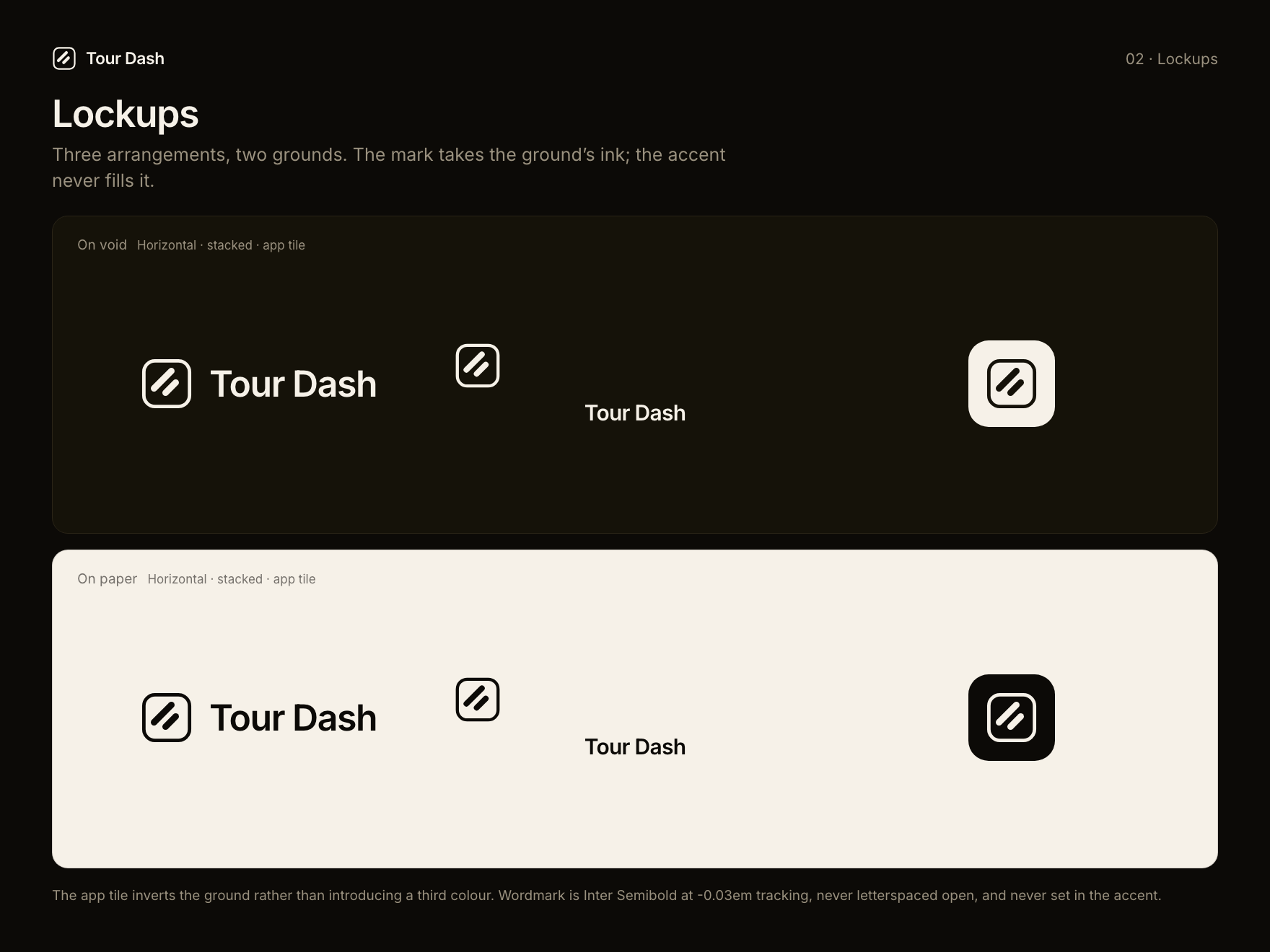
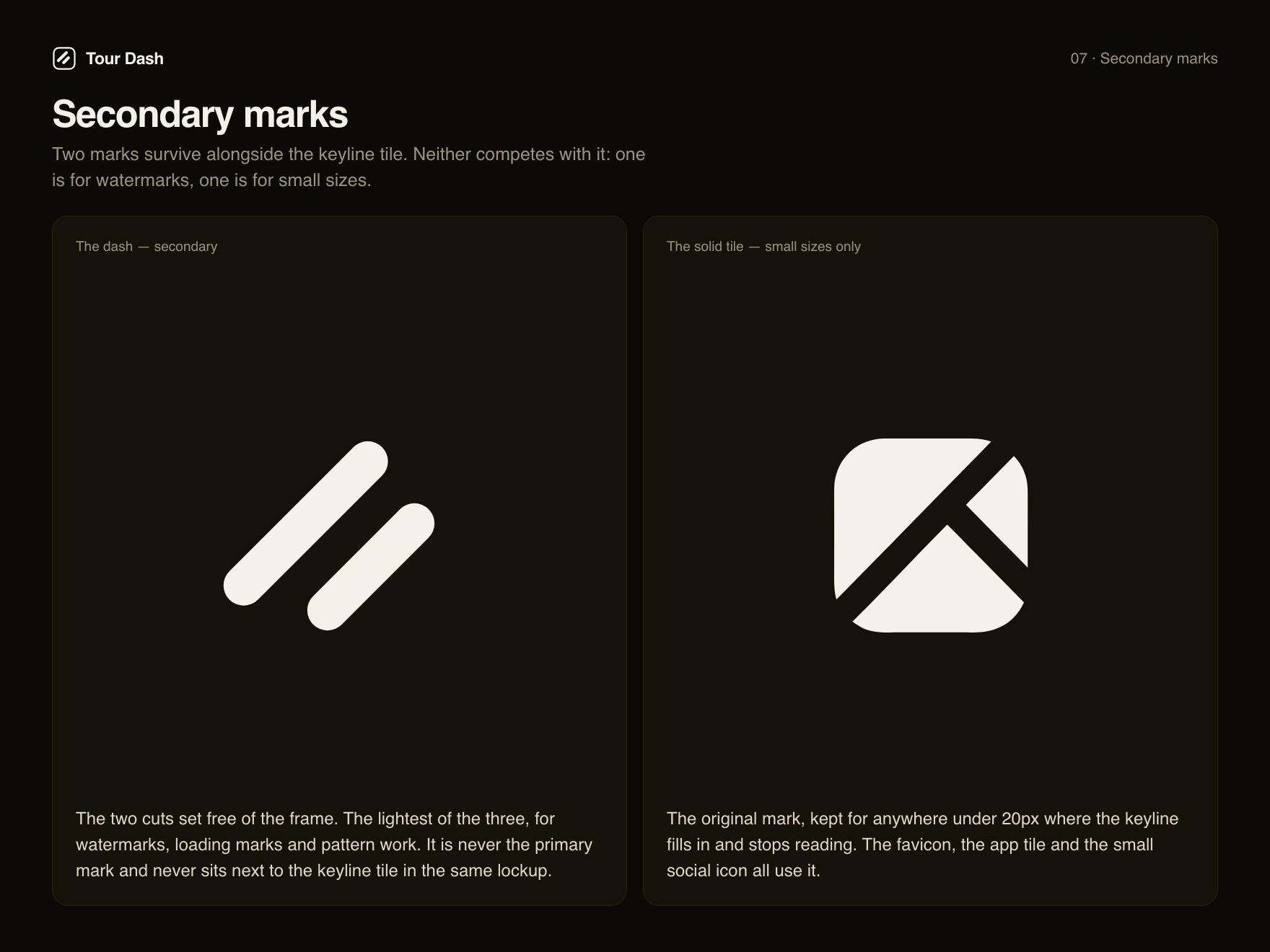
Two of the three marks from the options deck survive under the keyline tile, which is the normal shape of a mature kit. The dash is the watermark form. The solid tile, which used to be the primary, is now the small-size form and nothing else.
What the decision changed
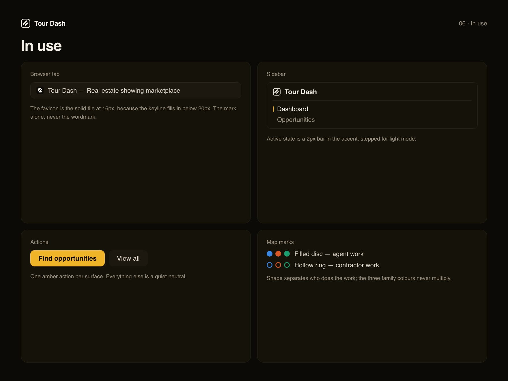
Both halves are live. The keyline tile is in the app sidebar, on the sign-in and signup pages, in this site’s header, and across the social assets. Estate amber and the warm neutral ramp replaced chartreuse everywhere, and the three service families were re-validated against the warmed grounds rather than assumed safe: all nine combinations still clear the 3:1 floor at 3.13:1 worst case, so their hues are unchanged.
The social profile icons, covers and per-platform bios built on this system are in Brand & Social Kit.