Agent Dashboard v2
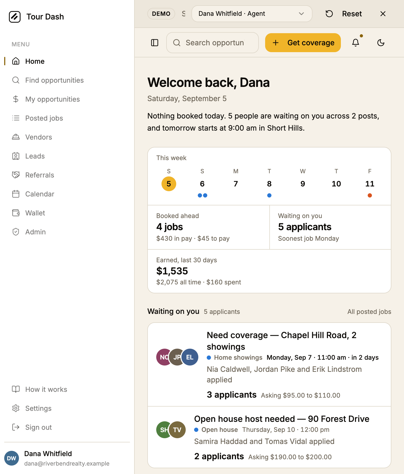
The Home page an agent opens every morning, on its second pass. The first version got the order right: who is waiting on me, what am I doing next, what else could I take. What it got wrong was the top of the page. The greeting said nothing, the date line said nothing the strip now says better, and the four figures in the rail repeated the numerals already sitting in the section rails a few inches to their left. This pass makes the top of the page earn its place and gives the sheet a pulse without giving it a carousel.
Where the first version fell short
The structure held. The redundancy did not.
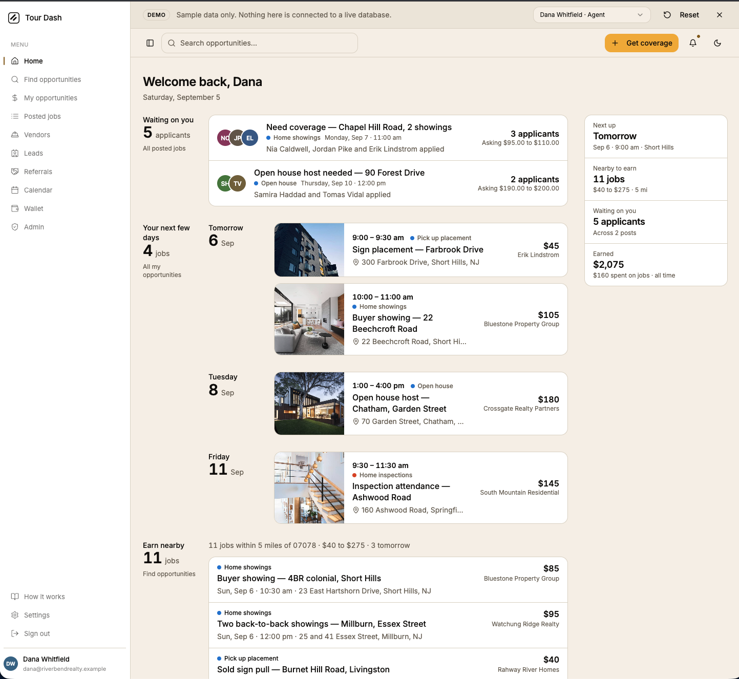
- The rail repeated the sheet. "Waiting on you: 5 applicants" sat beside a section rail reading "Waiting on you: 5 applicants". "Nearby to earn: 11 jobs" sat beside "Earn nearby: 11 jobs". "Next up: Tomorrow" was the first diary card said again in fewer words.
- The greeting was dead space. A name and a date, then a gap, then the sheet. The one place on the page an agent reads first said nothing about the day.
- No shape of the week. The diary showed four jobs in a column. Whether Wednesday was empty, or Sunday was the heavy day, took reading every card's date.
- The next job looked like every other job. The one the agent is about to drive to had the same 96px thumbnail as a job next Friday.
- Money had no direction. "Earned: $2,075 all time" is a vanity figure. What an agent plans around is what the booked week pays and what it costs.
- Urgency was invisible. Three people had applied for a Monday job, two days out, and the row read the same as one for next Thursday.
- "Nearby" showed no distance. The section's whole claim is proximity, and the miles were computed and thrown away before the row rendered.
- The accent never appeared. Today's numeral is the page's one accent, and on a day with nothing booked there was no today on the page.
What it is now
The same sheet, with a top that reads the day and a rail that only says what the sheet does not.
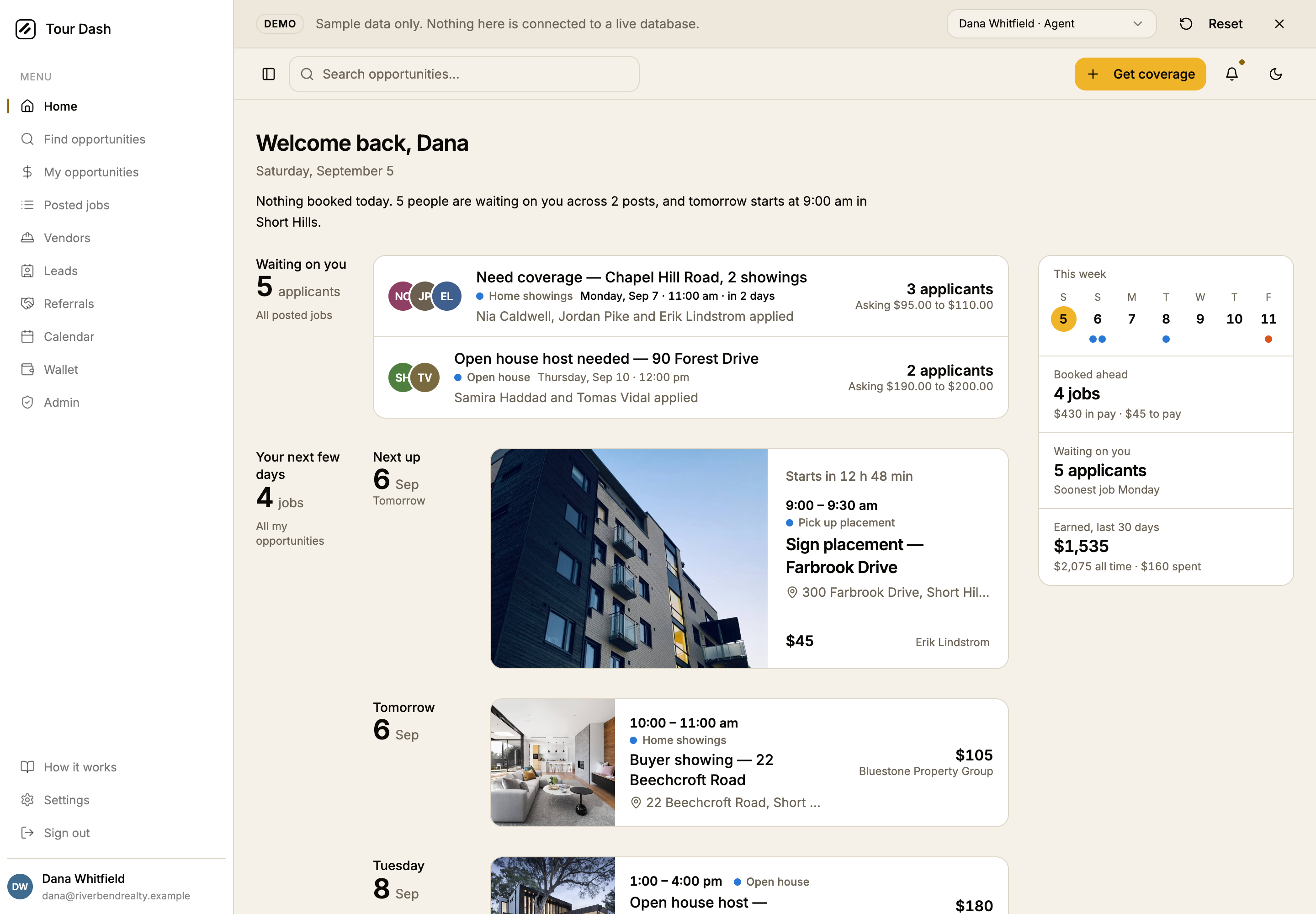
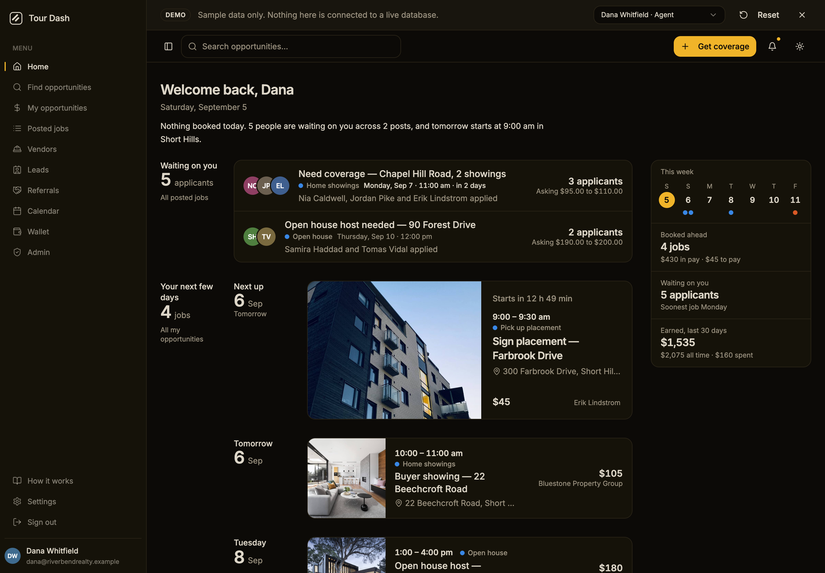
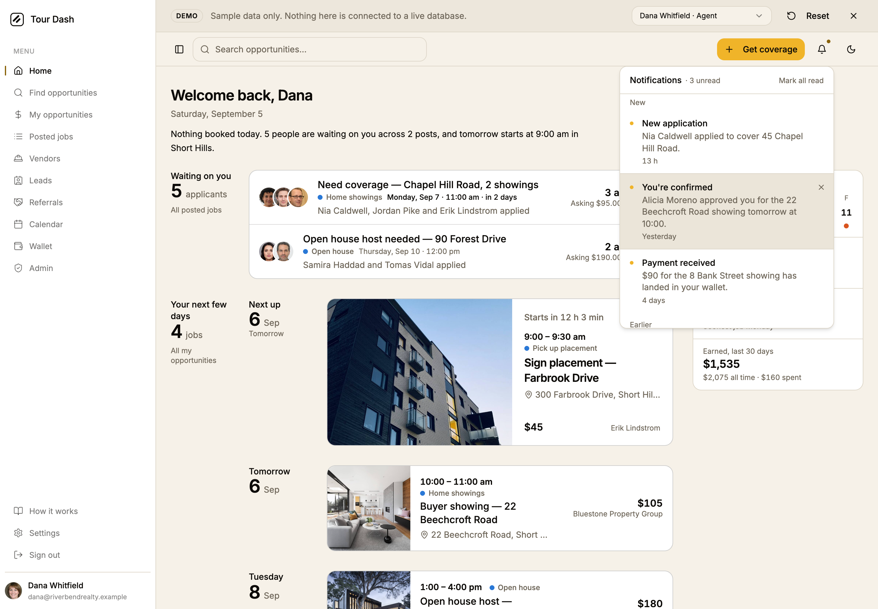
- A lede under the greeting. One or two sentences composed from the data: today first, then whoever is waiting, then when the next job starts and where. Each clause is only there when it is true, so a quiet day reads as a quiet day. A vendor's version says how many applications await a decision instead.
- The week as a strip. Seven days from today in the rail, one mark per booked job in the app's own marks (hue is the service family, a hollow ring is vendor work), today's numeral on the same amber disc the Calendar page uses. Every day is a button: a day on the sheet scrolls to it, any other day opens the Calendar on that date, which now accepts
?date=. - A spotlight for the next job. The first booked job gets a card the width of the sheet: the property photo across the left half, drifting a few percent over half a minute the way a photo screensaver does, and on the right a countdown that ticks once a minute. "Starts in 12 h 49 min" is the only text on the page that changes on its own, and it is allowed to, because the clock is real state. The diary of the remaining jobs follows beneath it in the same rail language.
- Rail figures that add. Booked ahead says what the week pays and what it costs, kept apart because a job you cover and a job you posted are not the same money. Waiting on you says which post needs somebody first. Earned is the last thirty days, with all time and spend as the detail.
- Urgency on applicant rows. A post whose job is within three days shows its date in ink rather than muted, with "in 2 days" appended past tomorrow, because the decision has a clock on it.
- Miles on nearby jobs. Under the pay and the brokerage, "0.2 mi", "2.1 mi", from the same point and radius the board uses.
- The page eases in. The rail and the sheet fade up over 300 ms with a short stagger. Under reduced motion the rise is dropped, the fade stays, the photo stands still, and the strip's scroll is instant.
- Nothing carousels. The request was for something that moves. An auto-rotating slideshow of upcoming jobs was considered and rejected: it hides three jobs to show one and moves while you read. The countdown, the drift and the strip move instead, and none of them takes information away.

Additions the same day
All asked for after the first deploy, on 2026-09-05 (commits e15878d, 5373b32, 26c6bfe, c9de832 and 87a619a).
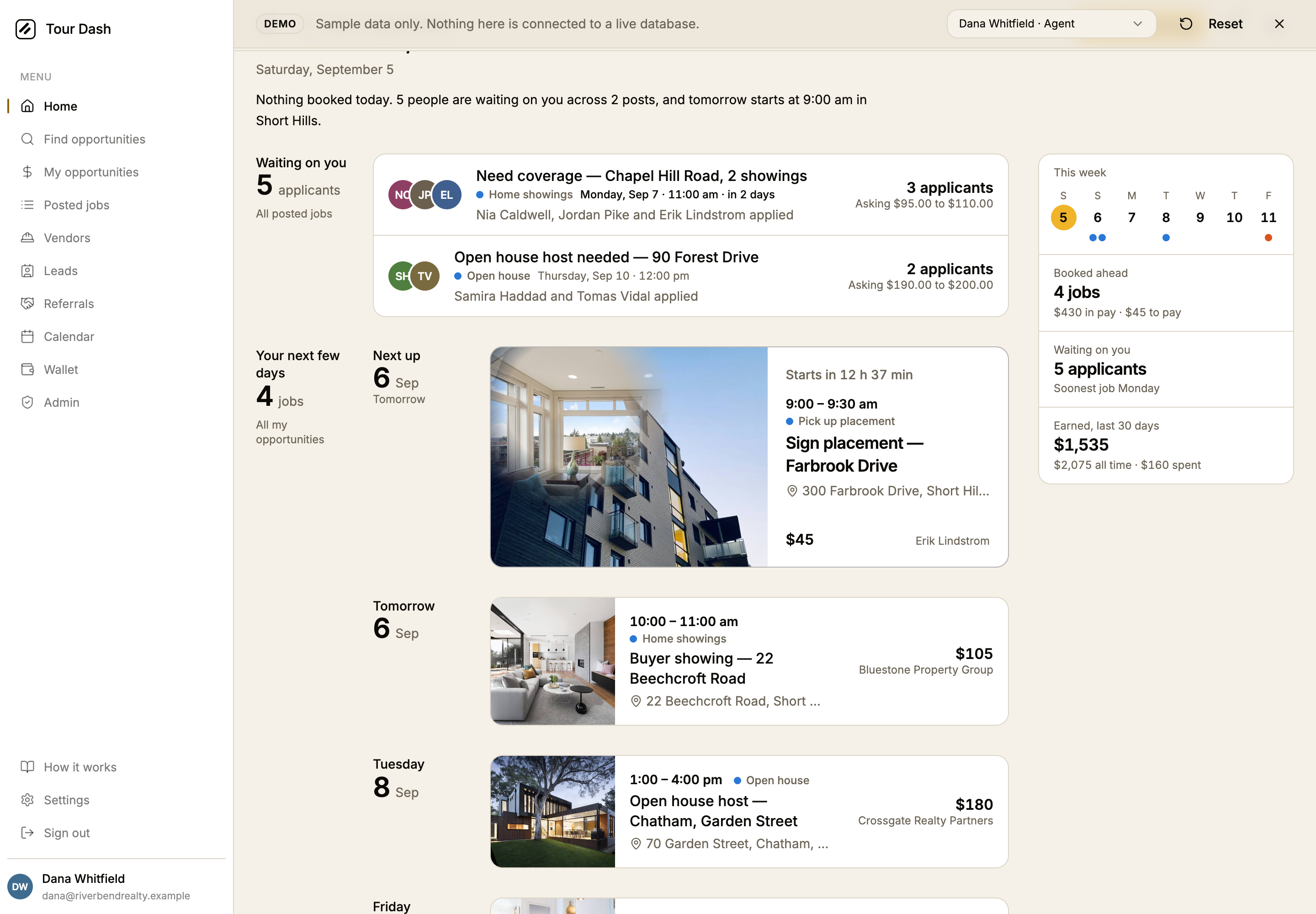
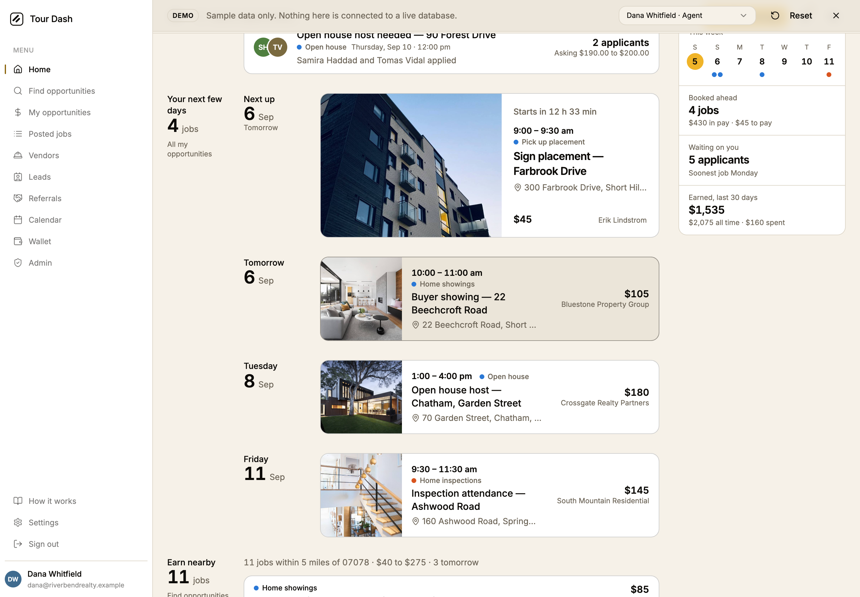
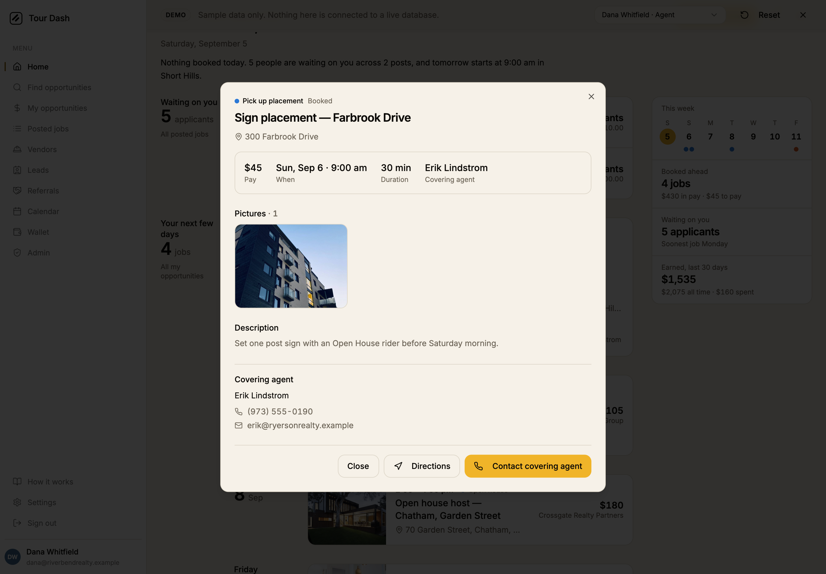
- A hover reveal on the spotlight photo. The ask was to pull it from GetLayers. Its section library has no image reveal; the closest technique is in Aerra, a property template where the cursor paints a site plan into a night photograph through a WebGL heat grid. That source was read and the idea rebuilt as a CSS mask driven by three variables written once a frame, because a card on a page opened every morning should not carry a GL context. Fine pointers only; on a phone the first photo is the card. Listings with one photo behave exactly as before.
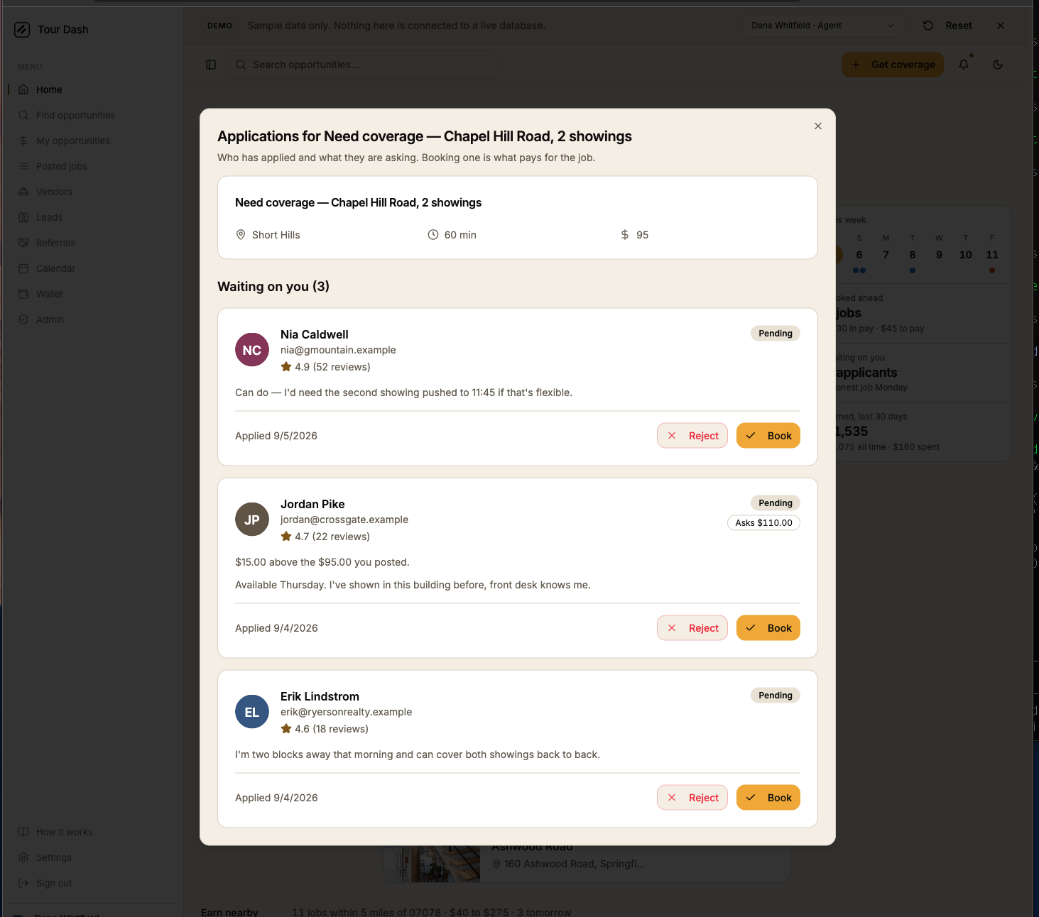
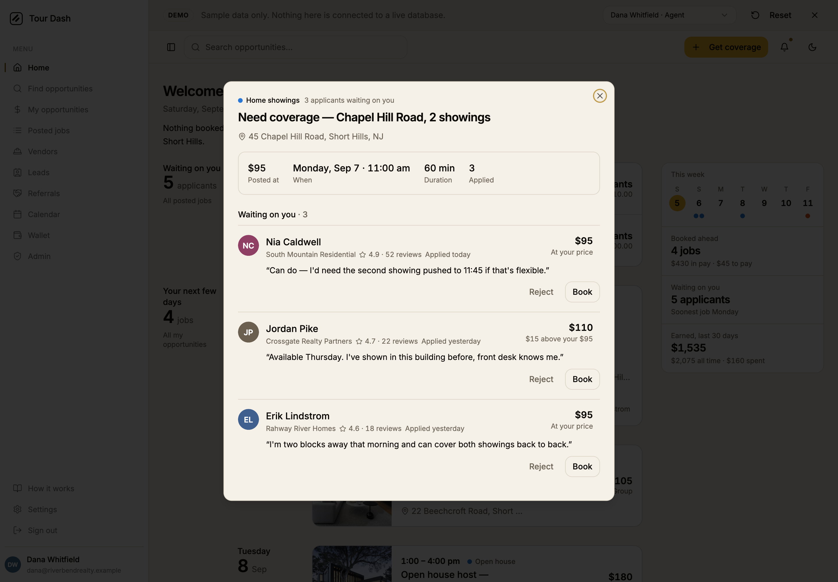
- The applications dialog, in the same language. It opened with the job's title twice, stacked each applicant in a card with their email, a Pending badge under a heading that already said pending, an amber star and an amber Book button on every row. Now the kind of work and who is waiting sit on the top line, then the title, the address, the job's facts as one strip, and the applicants as a hairline list built around what each person is asking, with the difference from the posted price under it. Names open profiles, dates are relative ("Applied yesterday"), money drops its empty cents, and no Book button is amber: choosing between equals is not the page's one action, so the row's figure carries the emphasis.
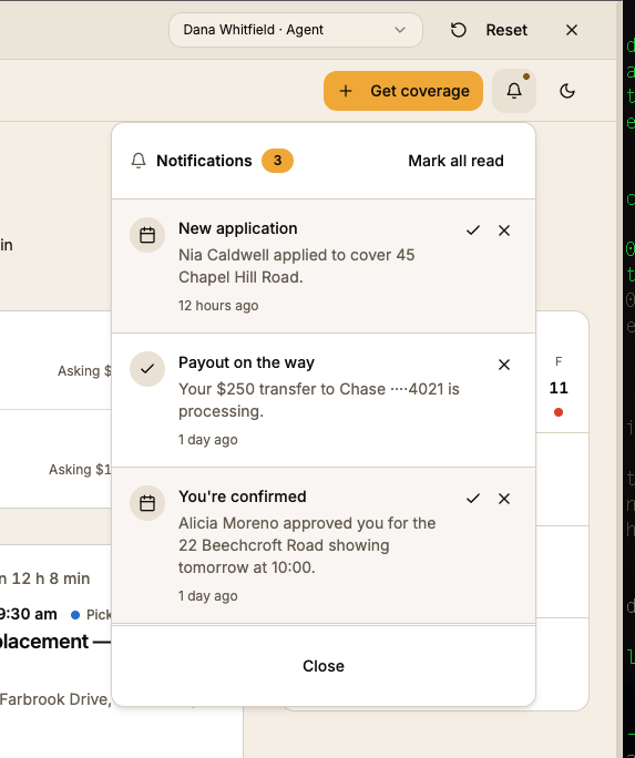
- Notifications that go somewhere. Whether they worked was the first question. The answer: the table exists on the live project, and the database writes a notice when somebody applies, when an application is approved, when a vendor is sent a job, when a lead sells and when one is disputed. Two things did not work. The bell's dot was painted on regardless of state, and the realtime channel the app subscribes to had never been given the table, so nothing arrived until a reload. The dot now shows only with something unread, the hook polls once a minute regardless, and a migration (
supabase/notifications-migration.sql, to be run once in the SQL editor) adds the table to the realtime publication, adds a link column so each notice knows its page, rewrites the trigger copy in the app's words ("New application", "You're booked"), and adds the notice applicants never got when they were passed over. The panel itself: rows are buttons that mark themselves read and open the page, unread rows sit first under New, dismiss appears on hover and stays on touch, and the Close button is gone. - Faces for the demo cast. Twenty-one initials marks became photographs of people who do not exist, picked by hand and cropped to 320px. The board's subtitle now says whose jobs it lists: "Jobs other agents posted near you. Apply to cover one and get paid when it's done."
- No search box on a phone. The one in the menu sheet is removed and the header's is desktop only; the Find tab is the phone's way to the board.
- One hover for every card. The applicant rows took a full accent fill on hover while the agenda cards and the spotlight only nudged a hairline, so it was hard to see which card was under the pointer. All of them now take the same fill and a firmer border, and the resting border steps up from the hairline to ink at a fifth. My opportunities and Calendar share the card, so they follow.
How it was checked
- Type check and production build both pass.
- Headless Chrome over CDP against /demo at 390 (touch), 768, 1024 and 1440, light and dark. Layout viewport width equals scroll width at every size. Console clean, after fixing a pre-existing badge-inside-paragraph nesting warning in the nearby list.
- Interactions exercised: the strip scrolls to a day on the sheet and opens the Calendar on the requested date otherwise, on desktop click and phone tap; the spotlight opens the booked-job dialog; the vendor account renders its own lede and rail through the demo switcher.
- Deployed. Commits b8921c8 through 5373b32 on main, shipped to tour-dash.pages.dev on 2026-09-05 through 87a619a the same evening; the notifications migration still has to be run in the Supabase SQL editor; the live bundle was re-read after each deploy and contains the new code.
- The hover reveal was exercised in headless Chrome: the torch opened to a measured radius on hover, followed the pointer to an off-centre point, and returned to zero on leave. The hover pass was shot with a card and a row under the pointer in both themes.
Files
| File | What changed |
|---|---|
| src/pages/Index.tsx | The lede, the strip in the rail, the rebuilt figures, the spotlight with the diary of the rest beneath it, entrance motion, miles on nearby rows. |
| src/components/WeekStrip.tsx | New. Seven days, a mark per job, today on the amber disc, every day a button. |
| src/components/NextUpCard.tsx | New. The spotlight card, the "Starts in 18 h 40 min" wording, and the cursor-driven reveal of the second photo. |
| src/components/NotificationsPopover.tsx | Rewritten: rows are buttons that open their page, New and Earlier groups, dismiss on hover, no footer. |
| src/lib/notifications.ts | New. Where a notice goes (its link, else a page by type) and the short relative time. |
| src/hooks/useNotifications.ts, src/components/AppHeader.tsx, src/components/AppSidebar.tsx | Polling once a minute; the bell's dot only with unread; the phone menu's search box removed. |
| supabase/notifications-migration.sql | New, not yet run: link column, trigger copy, the rejection notice, realtime publication. |
| src/components/ApplicationsDialog.tsx | Rewritten in the booked-job dialog's order: facts strip, hairline applicant list, asking figure per row, relative dates, skeleton loading, no badges. |
| src/demo/demo-data.ts | The demo's next job gains a second photo so the reveal has something to show. |
| src/hooks/useNow.ts | New. The clock behind the countdown, once a minute. |
| src/components/AgendaList.tsx | Optional per-day ids so the strip can scroll to a day. |
| src/components/ApplicantsWaiting.tsx | Dates within three days read in ink, "in 2 days" past tomorrow. |
| src/components/OpenWorkList.tsx | Miles under the pay; the badge row is no longer inside a paragraph. |
| src/components/SummaryFigures.tsx | A figure can take a grid placement class. |
| src/pages/Calendar.tsx | Opens on ?date=YYYY-MM-DD. |
| src/index.css | The drift keyframes, held still under reduced motion. |